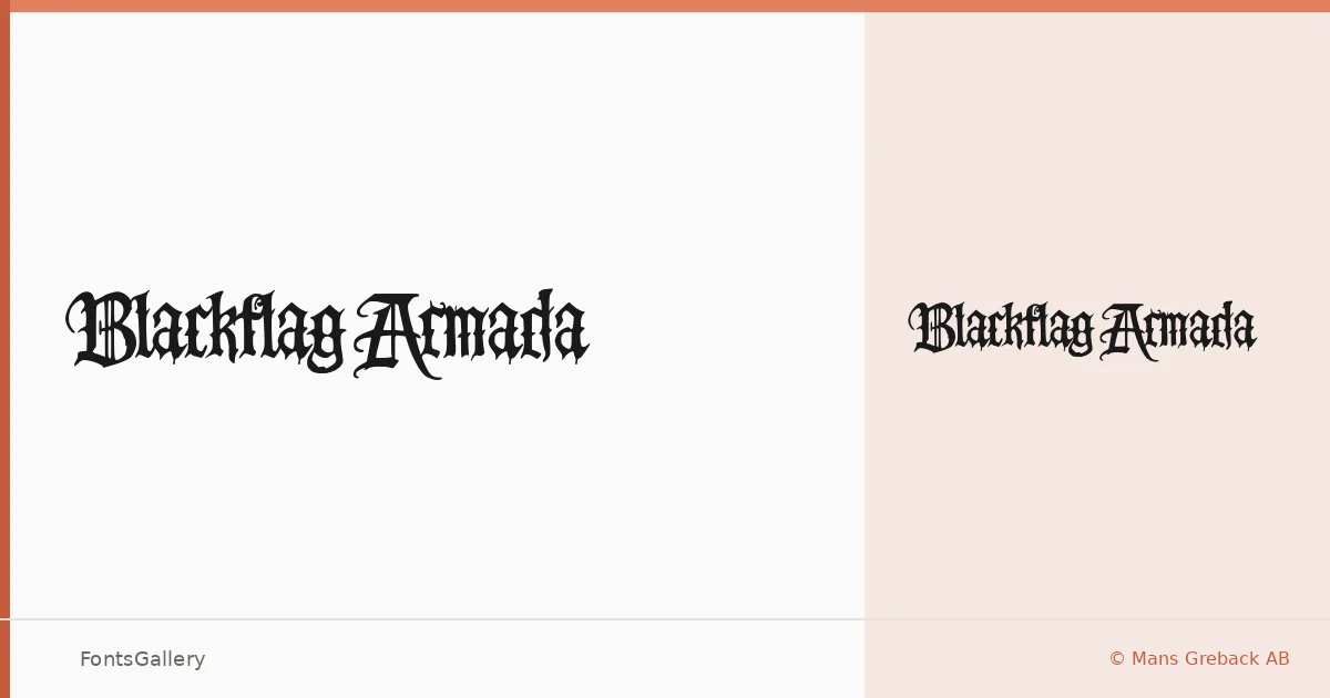
About Blackflag Armada Font
There is something deliberately heavy and weathered about this blackletter, the kind of weight that feels earned rather than applied. Designed by Mans Greback of Mans Greback AB, it carries the angular tension and dense stroke contrast that define the blackletter tradition, pushed here toward a grunge sensibility that keeps it from reading as purely historical.
Design Aesthetics & Character Characteristics
The family ships as a single Regular cut in OTF format, so the work is all in how you deploy it. The mood runs bold and vintage with a grunge edge — letterforms that evoke hand-painted signs, band merch, and ink pressed hard into paper. Latin and partial Latin Extended coverage is included, along with Vietnamese support, which broadens its reach beyond what you might expect from a face this rooted in classic Germanic forms.
Recommended Usage & Font Pairing
The natural territory is anywhere contrast and character are the point: poster headlines, logo lockups, signage, and t-shirt graphics where a raw, classic authority matters. For pairing, the face holds its own against cleaner companions — Helvetica or Bahnschrift provide a stark, neutral counterweight, while Canela or ABC Arizona soften the contrast with their editorial warmth, and Etna adds a complementary vintage register.
License & Usage Terms
This family is available under Personal Use terms only — confirm a commercial license directly with the designer at www.mansgreback.com before using it in any paid or client-facing work, and note that embedding is restricted under the current license.