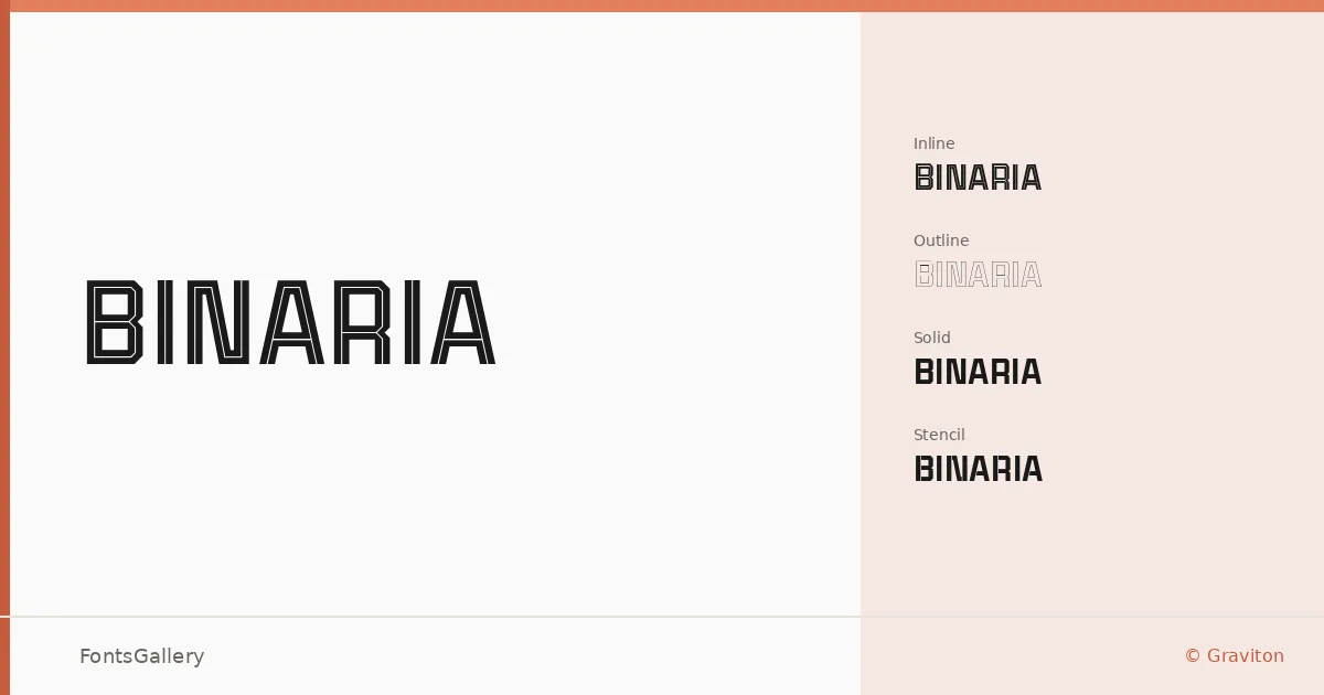
About Binaria Font
Four cuts, one idea — each rendering the same geometric skeleton in a different state of completion. Pablo Balcells, designing under the Graviton foundry, built this display family around a single modular structure and then stripped it back, outlined it, cut holes through it, and left it solid. The result is a system rather than a typeface in the conventional sense.
Design Aesthetics & Character Characteristics
The family sits squarely in display territory, with a bold, minimal presence that reads as modern and deliberately architectural. The four OTF styles — Regular Inline, Regular Outline, Regular Solid, and Regular Stencil — are designed to be used in dialogue with one another as much as independently. Solid gives you full weight and authority; Outline strips it to a contour; Inline layers a channel through the strokes; Stencil breaks the forms with bridges, lending an industrial, professional edge to the cut.
Recommended Usage & Font Pairing
The set is built for high-impact work: headline typography, branding systems, poster composition, logo development, and T-shirt design where a strong silhouette matters. Layering the Solid and Outline cuts at the same size and position is an obvious move that pays off quickly. For text companions, the family has been paired with Helvetica, Aresink, Alexandria, Bizantheum, and Audex — clean, structured faces that let the display cuts lead without competition.
License & Usage Terms
This family is offered under Personal Use terms, which means commercial use is not permitted — confirm licensing with Graviton before taking it into any paid branding, print, or commercial production work. Embedding is limited to preview and print only.