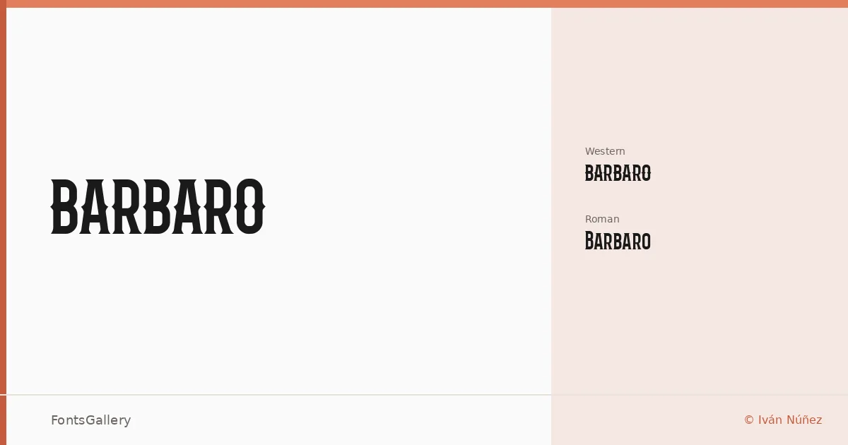
About Barbaro Font
Two cuts, one Roman and one Western, designed by Iván Núñez — and the tension between them tells you everything about this family's ambitions. The Roman carries its weight with the confidence of a headline face that knows exactly where it belongs, while the Western leans into something more characterful and period-aware without tipping into pastiche.
Design Aesthetics & Character Characteristics
This is a display family in the truest sense: built for scale, built for impact, and not especially interested in body copy. Both styles — Barbaro Roman and Barbaro Western — arrive as TTF files with Latin coverage (partial), which suits the branding and editorial contexts they were clearly drawn for. The forms read as bold and modern, but with enough personality in each cut to hold a reader's eye on a poster or a magazine opener. The Western variant in particular carries a structural drama that makes the two siblings feel genuinely distinct rather than merely stylistically flavored versions of the same idea.
Recommended Usage & Font Pairing
Think headlines, logo lockups, poster hierarchies, and magazine mastheads — anywhere the type needs to carry visual authority at large sizes. For pairing, the family works well alongside Canela or Etna when you want complementary contrast in editorial layouts, and Helvetica or Bahnschrift when a cleaner, more neutral secondary face is needed to let the display work breathe. AQUA is worth considering if the project calls for something with more flair in supporting roles.
License & Usage Terms
This family is available for commercial use. Note that embedding permissions are limited to preview and print only, so confirm that restriction fits your workflow before deploying in interactive or app-based environments.