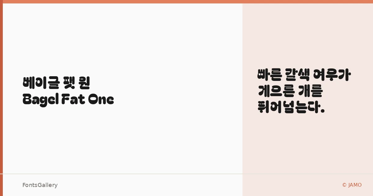
About Bagel Fat One Font
There is something immediately appetite-whetting about these letterforms — rounded, inflated, and unapologetically heavy, they carry the kind of visual weight that commands attention without resorting to aggression. Kyung-won Kim at JAMO drew this single-weight display face to cover both Latin and Hangul, a bilingual scope that makes it genuinely rare among display typefaces of this character. The curves are generous and the counters plump, giving each glyph a playful pressure from within, as though the ink is still pushing outward.
Design Aesthetics & Character Characteristics
Bagel Fat One sits firmly in the display category — bold, modern, and playful are not incidental descriptors here but structural commitments baked into every letterform. The family ships as a single Regular cut in TTF, which means there is no weight range to navigate; the design statement is fixed and deliberate. That single-minded heaviness is actually a strength: the face knows exactly what it is, and the rounded geometry reads with equal confidence whether it is rendering the Latin alphabet or Hangul syllables.
Recommended Usage & Font Pairing
This is a face built for headlines, posters, branding work, social media graphics, and T-shirt design — anywhere a large, confident display moment is needed and subtlety would be wasted. The bilingual Latin and Hangul coverage opens genuine possibilities for Korean-market campaigns or mixed-script editorial work. When you need a counterpoint for body text or secondary type, it has been paired effectively with Canela and ABC Arizona for an editorial contrast, with Helvetica and Bahnschrift for a more functional neutrality, and with Etna when a serif warmth is called for.
License & Usage Terms
Released under the SIL Open Font License, Version 1.1, commercial use is permitted; full terms and the accompanying FAQ are available at https://scripts.sil.org/OFL. Embedding is set to installable, so the font may be bundled freely in documents and applications.