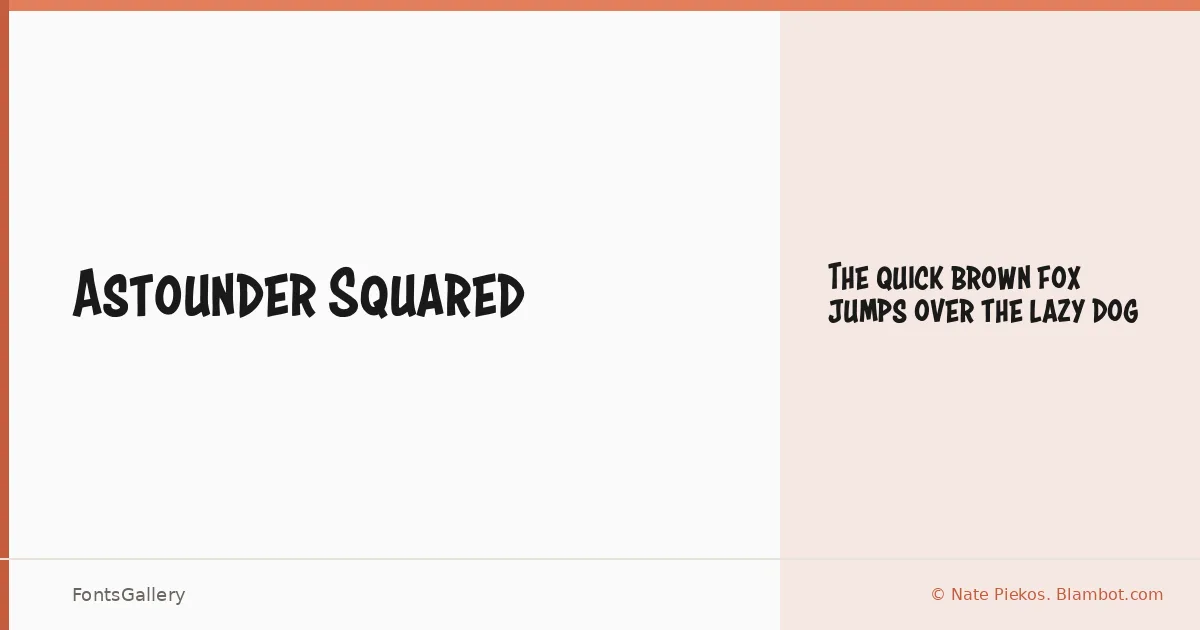
About Astounder Squared Font
There is something immediately physical about this face — the geometry is blunt, the corners squared off with a confidence that reads as deliberate rather than mechanical. It comes from Nate Piekos of Blambot.com, a designer with deep roots in comic and display lettering. The single Regular cut is delivered as an OTF file, built with the kind of clarity that holds up at headline scale.
Design Aesthetics & Character Characteristics
This is a display face in the most committed sense of the word — bold, playful, and a little whimsical without tipping into chaos. The squared construction gives the letterforms a chunky, almost modular quality that catches the eye on posters and logo treatments. Latin coverage is partial, and Vietnamese is supported, which extends its reach across a reasonable range of projects. At its single weight, it asks you to commit fully to the size and context rather than rely on variation.
Recommended Usage & Font Pairing
It earns its keep in headlines, posters, logo work, and T-shirt design — anywhere the job calls for something bold and a little loud without being aggressive. For body copy or secondary type, it pairs well with clean neutrals like Helvetica or the structured forms of Alexandria and Audex; more expressive companions like Aresink and Bizantheum can match its energy when a headline-only layout needs multiple display voices.
License & Usage Terms
This family is available under Personal Use terms — commercial use is not permitted, so confirm clearance before taking it into any paid work. Embedding is limited to preview and print only.