About Army Font
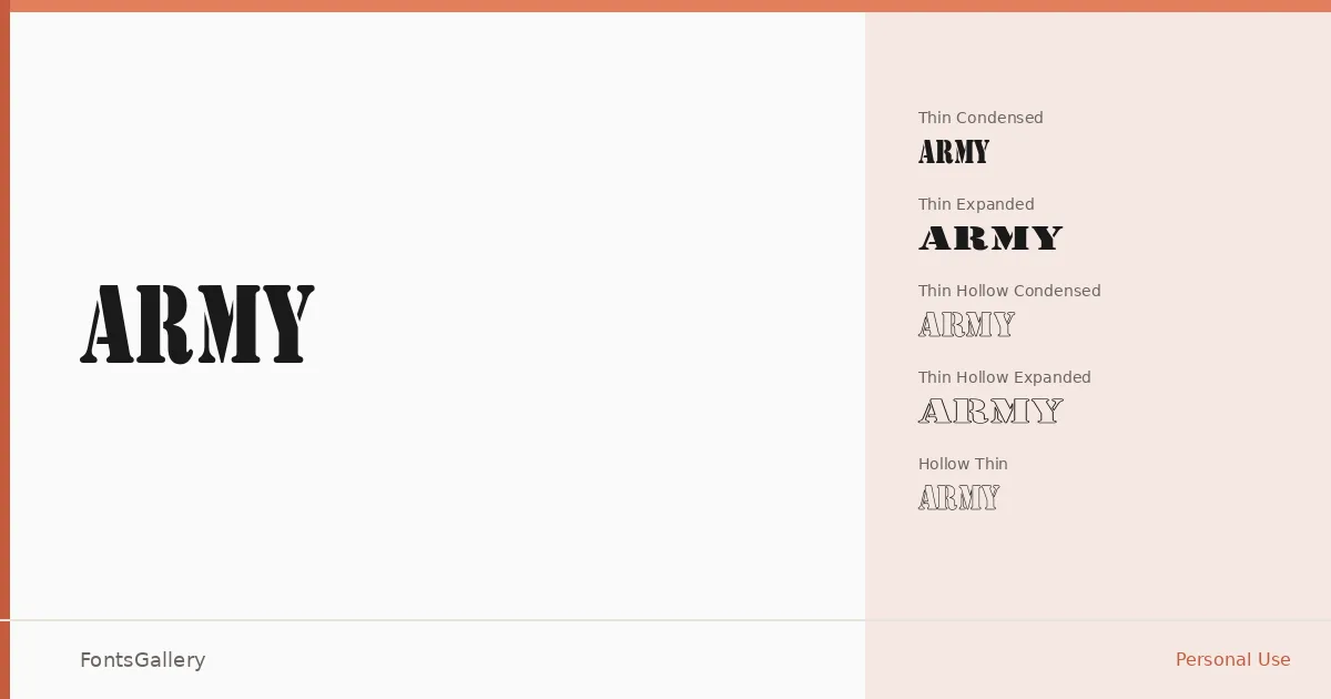
There is a deliberate roughness to these letterforms — the kind of controlled grit that recalls stenciled crates and weathered signage rather than the polished output of a typesetting house. The family arrives in a single weight tier, Thin, but sprawls across ten structural variants that reshape its proportions and silhouette dramatically. Converted by ALLTYPE, it sits firmly in display territory, built for situations where a headline needs to carry attitude before a reader even absorbs the words.
Design Aesthetics & Character Characteristics
The family spans condensed, regular, wide, and expanded widths, then doubles each core proportion into a hollow counterpart — giving you Army Condensed, Army Expanded, Army Wide, Army Hollow, Army Hollow Condensed, Army Hollow Expanded, Army Hollow Wide, Army Hollow Thin, Army Thin, and the base Thin Regular. That hollow series opens the strokes into outlined forms, which shifts the mood from blunt grunge to something more vintage and graphic. All cuts ship as TTF files and cover Latin script. The overall feeling across the family is bold and professional in the way that military stenciling is professional: functional authority with earned wear.
Recommended Usage & Font Pairing
The width range makes it genuinely useful across poster layouts, logo lockups, signage, and T-shirt graphics — anywhere a headline needs to hold a wall or anchor a composition without apology. The hollow variants work especially well when printing on dark grounds or layering over photographic backgrounds. For pairing, the structured geometry of Bahnschrift or Helvetica provides a clean counterweight to its grunge energy, while Etna and Canela offer contrast through their calligraphic warmth; AQUA can amplify the vintage register when that direction suits the project.
License & Usage Terms
This family is released under Personal Use terms, which means commercial use is not permitted — confirm licensing before committing it to any client or revenue-generating work.