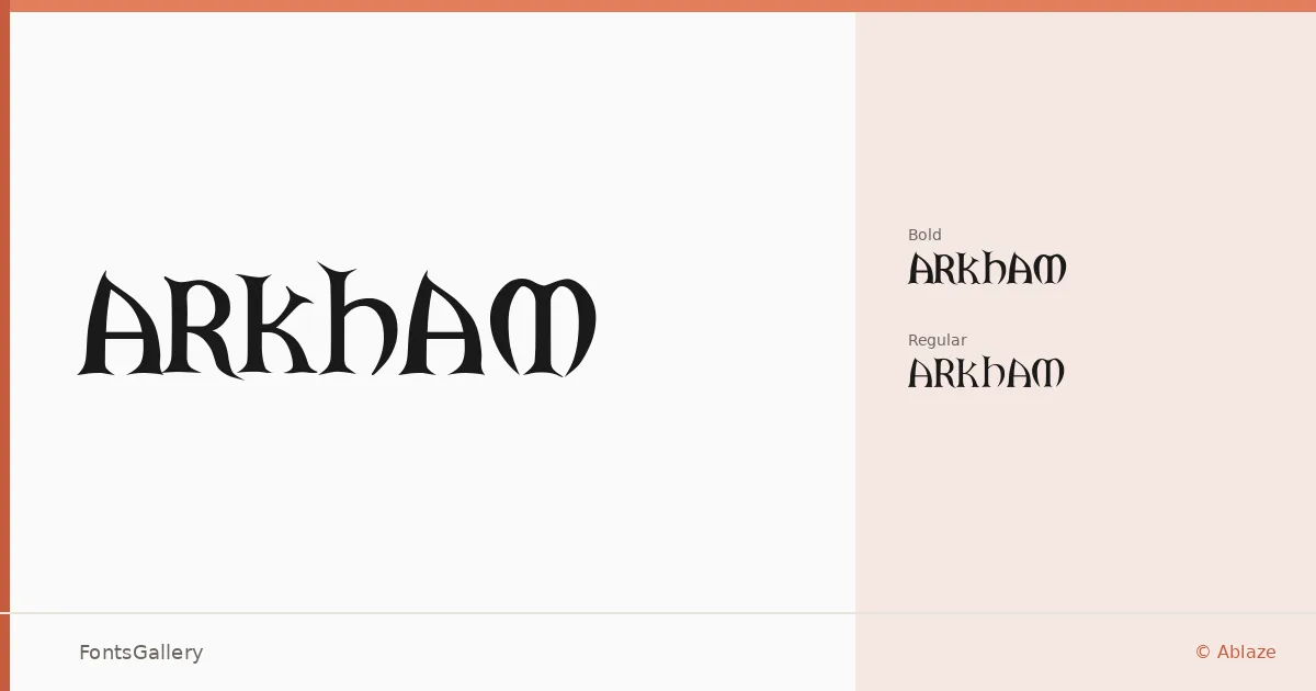
About ARKHAM Font
There is a deliberate tension in these letterforms — the kind that comes from grunge textures pressed against classical structure, producing something that feels excavated rather than designed. The family was created by J Cianciaruso and carries a vintage character that reads as aged and authoritative at once. Ablaze brought it to distribution, and its two cuts, Regular and Bold, cover the range most display work actually demands.
Design Aesthetics & Character Characteristics
This is a display family built for impact at large sizes, where the rough edges and classic proportions do their best work. The grunge detailing gives headlines a worn, tactile quality without tipping into illegibility, and the bold weight pushes that energy further without losing the underlying structure. Both styles are delivered as TTF files with installable embedding permissions, making them straightforward to deploy across documents and layouts.
Recommended Usage & Font Pairing
The face earns its keep on book covers, posters, and branding projects where a vintage or worn aesthetic is part of the brief — logo lockups and headline treatments especially benefit from that classic-grunge character. For Latin-language projects, the coverage is solid throughout. It contrasts well against clean, rational companions: Helvetica or Josefin Sans provide a neutral counterweight, while Canela, Asap, or ABC Arizona offer softer editorial alternatives that let the display weight hold its ground without overwhelming the page.
License & Usage Terms
ARKHAM is available under Personal Use terms, which means commercial use is not permitted — confirm licensing directly with the rights holder before committing it to a client job.