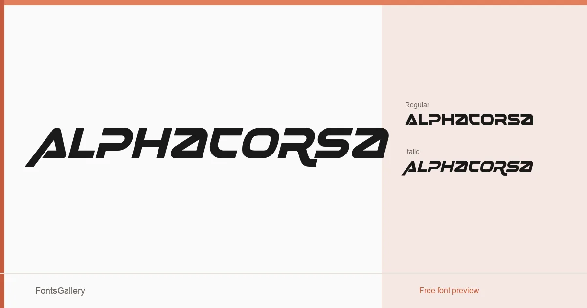
About Alphacorsa Font
There is something deliberately forward-leaning about these letterforms — a tension built into the strokes that reads as momentum before you even clock the italic. Muhammad Afif Ersya at Lettercorner Studio has constructed a display face that earns its futuristic mood through the geometry of the glyphs rather than through decoration. The family covers Latin (partial) and ships in TTF format.
Design Aesthetics & Character Characteristics
The family offers two cuts: a Regular and a Regular Italic, the latter carrying that kinetic angle which defines the whole system. Both sit firmly in the display category, carrying a bold, modern energy that feels tuned for situations where the type needs to hold its ground at large sizes. The forms are clean and assertive without relying on ornament — the structure does the work.
Recommended Usage & Font Pairing
This is a face built for headlines, posters, logo lockups, and branding work where a strong, contemporary voice is the brief — it also translates naturally to T-shirt graphics and apparel applications. For text underneath or alongside, the listed pairings point toward rational, neutral counterparts: Helvetica and Alexandria provide grounded contrast, while Aresink, Bizantheum, and Audex offer options for staying within a more stylised, design-forward palette.
License & Usage Terms
Alphacorsa is released under a Personal Use license by Lettercorner Studio — commercial use is not permitted under these terms, so confirm licensing directly at Lettercornerstudio.com before using it in any client or commercial project. Embedding is set to installable.