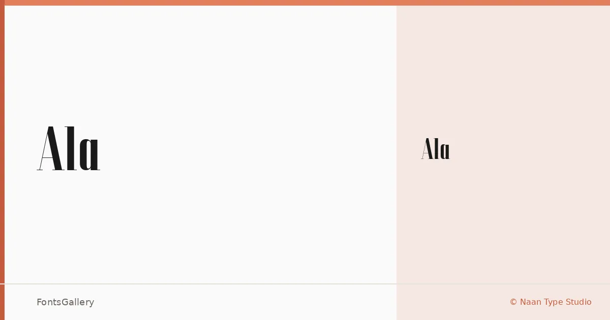
About Ala Font
There is a restrained confidence to this display face — the kind that comes from knowing exactly when to stop. Designed by Naan Type Studio, Ala arrives as a single Regular cut, which is a deliberate constraint that focuses the eye on what the letterforms themselves can carry. The shapes lean into elegance without ornament, drawing their authority from proportion and spacing alone.
Design Aesthetics & Character Characteristics
This is a display typeface built around a minimal, modern sensibility with a clear lean toward luxury applications. The single Regular weight is offered in OTF format, and the design rewards generous sizing — set it large and the character of each glyph becomes the composition. Partial Latin coverage means it handles the core Western alphabet cleanly, without the clutter of extended glyph sets that can dilute a focused display design.
Recommended Usage & Font Pairing
The face earns its place in headline settings, poster work, and editorial magazine layouts where a cool, minimal register is the goal. Logo and branding treatments that call for understated luxury will find the forms hold up well at both large scale and fine print reproduction. It pairs naturally with the geometric clarity of Helvetica or Bahnschrift, and the editorial weight of Canela, Etna, or Times New Roman can provide the texture contrast that a single-weight display face often needs in body copy.
License & Usage Terms
Ala is released under Donationware terms, which do not allow commercial use — confirm licensing arrangements before committing it to a paid project. The font does carry installable embedding permission.