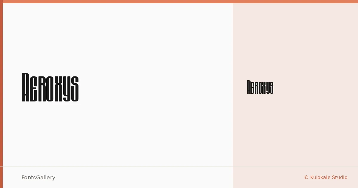
About Aeroxys Font
There is a hard-edged tension in these letterforms — the kind that sits comfortably on the front of a band tee or commands attention across a concert poster. Aeroxys was created by M Arif Dwi Prasetyo and Eko Nurcahyo under Kulokale Studio, and it arrives as a single Regular cut delivered in TTF format.
Design Aesthetics & Character Characteristics
This is a display face that leans hard into a futuristic, grunge-inflected boldness — the strokes carry a raw, modern energy that resists any reading of refinement. There is only one style here, Regular, and it is built to carry weight on its own: the forms are assertive enough that no additional cuts are needed when the goal is impact. Latin script is supported.
Recommended Usage & Font Pairing
It earns its place in branding systems, logo lockups, poster headlines, and T-shirt graphics where attitude is part of the brief — not as body copy, but as the thing that stops the eye first. For contrast, the clean geometry of Bahnschrift or Helvetica works well against its rougher edges, while something as authoritative as Times New Roman or as refined as Canela creates a useful tension in editorial or brand contexts. Etna is another option worth exploring when the surrounding design shares a similarly expressive character.
License & Usage Terms
This family is available under a Personal Use license, which means commercial use is not permitted — confirm licensing terms directly with Kulokale Studio before applying it to any client or commercial work. Embedding is limited to preview and print only.