About Aero Font
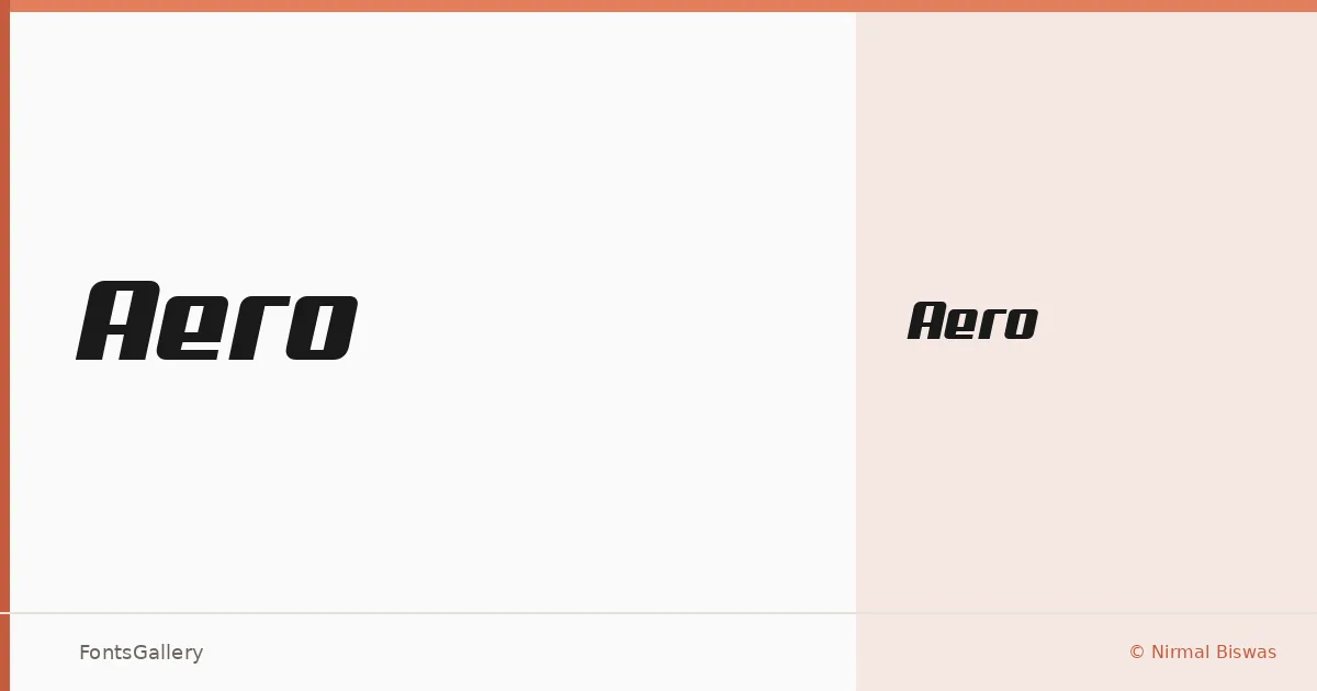
There is a deliberate forward lean to these letterforms — a sense of propulsion built into the skeleton of every glyph. Designed by Nirmal Biswas, this single-weight display face sits comfortably in the space between the mechanical and the modern, with clean geometry that reads as both professional and futuristic.
Design Aesthetics & Character Characteristics
The family ships as one cut — Medium Regular in TTF — which keeps the proposition simple: this is a headline voice, not a text workhorse. The forms carry a bold, modern confidence without resorting to decorative excess. Sharp terminals and considered spacing give it a composed presence at large sizes, the kind that holds up on a poster or a logo lockup without feeling overwrought.
Recommended Usage & Font Pairing
It earns its keep in branding, advertising, and editorial headline work where a futuristic edge serves the concept. Latin character coverage makes it well suited to those contexts across Western European markets. For body copy or secondary text, the geometric neutrality of Bahnschrift or Helvetica provides a clean contrast, while Canela or Times New Roman adds a softer, more editorial counterweight — and Etna offers a closer stylistic neighbor when layering display elements.
License & Usage Terms
Aero is released under a Donationware license, which covers personal use only — confirm with the designer before committing it to a commercial job. Embedding is permitted at the installable level.