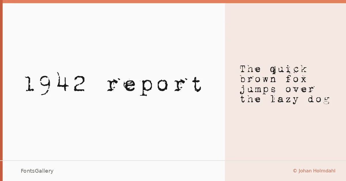
About 1942 report Font
There is something immediately familiar about a typewriter face that has been roughed up just enough to feel lived-in — keys that struck paper unevenly, ribbons running thin toward the end of the roll. This single-cut family, designed by Johan Holmdahl, delivers exactly that sensation: a monospace Regular that reads as vintage without tipping into parody.
Design Aesthetics & Character Characteristics
The family sits in monospace territory but carries a grunge character that separates it from clean, clinical fixed-width faces. The letterforms have the slightly irregular weight and baseline tension of wartime correspondence or period journalism — classic in structure, worn in texture. Available as a TTF Regular, it covers Latin characters on a partial basis, so keep that in mind for any copy that ventures beyond standard Western text. The mood lands somewhere between professional restraint and deliberate distress, which is a harder balance to strike than it sounds.
Recommended Usage & Font Pairing
The face earns its keep in headline work, editorial layouts, poster design, and branding contexts where a period aesthetic matters — it also translates convincingly to T-shirt graphics, where that typewriter grain reads well against fabric. For pairing, it contrasts cleanly against the geometric neutrality of Helvetica, or holds its own alongside the more decorative personalities of Aresink, Alexandria, Bizantheum, and Audex.
License & Usage Terms
1942 report is offered under Personal Use terms — commercial use is not permitted, so confirm your rights with the designer before committing it to a client job. Embedding is set to installable.