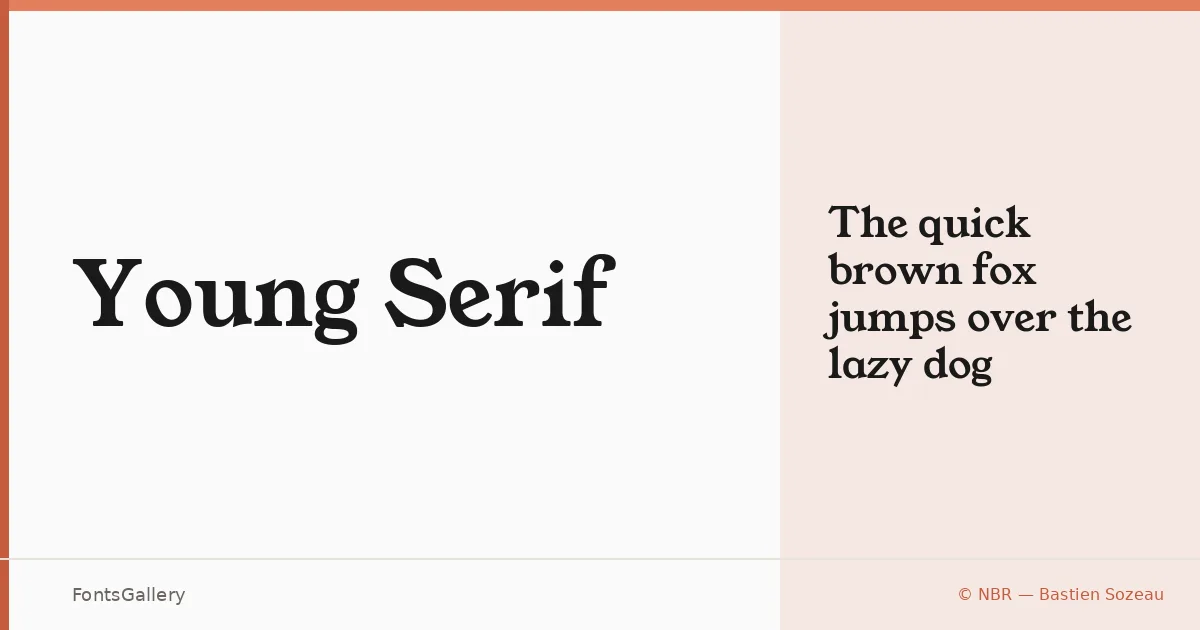
About Young Serif Font
There is something immediately assured about this serif — the kind of confidence you see in editorial type from an earlier era, redrawn with a cleaner hand. It comes from Bastien Sozeau of NBR, and it arrives as a single Regular cut in TTF format. The letterforms carry a classical structure while shedding the accumulated dust of strict historicism, sitting somewhere between the warmth of vintage book typography and the economy of a more modern sensibility.
Design Aesthetics & Character Characteristics
The design reads as classic and elegant without tipping into pastiche — the contrast feels considered rather than dramatic, and the serifs themselves have a crispness that holds up well at larger sizes. As a single Regular weight, it is a focused tool: everything it does is concentrated in one carefully drawn style rather than spread thin across a range. That restraint suits it well to settings where the type needs to carry presence on its own.
Recommended Usage & Font Pairing
It belongs most naturally in headline and display work — book covers, magazine spreads, logo lockups, and brand identities where a serif with some vintage character anchors the composition. Latin script is covered. For pairing, the neutrality of Helvetica or Aileron makes a clean counterpoint to its personality, while Allura brings a calligraphic contrast; Ballmain and Abrade offer alternative directions depending on whether the brief calls for something more contemporary or structural alongside it.
License & Usage Terms
Young Serif is released under the SIL Open Font License, Version 1.1, which permits commercial use; full terms and the accompanying FAQ are available at https://scripts.sil.org/OFL. Embedding is permitted at the installable level.