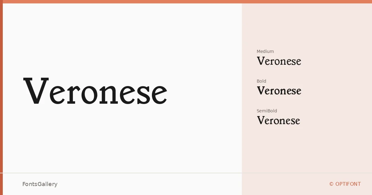
About Veronese Font
There is a particular confidence to a well-drawn slab serif — the way the serifs anchor each stroke without letting the face turn stiff. This family from OPTIFONT carries that quality, drawing on a classic editorial tradition that reads as composed rather than rigid. The letterforms sit somewhere between the composing room and the boardroom, with enough vintage character to feel considered rather than generic.
Design Aesthetics & Character Characteristics
As a slab serif, it occupies the elegant and professional end of the spectrum, with a mood that leans vintage without tipping into nostalgia. The family ships in three OTF cuts — Regular, SemiBold, and Bold — giving you a workable weight range for hierarchy without overextending into extremes. Each weight maintains the same classical structure, so the family holds together tightly across a layout. Latin character support is partial, which is worth checking against your copy before committing.
Recommended Usage & Font Pairing
The weight and authority of these serifs make them most at home in headline roles: book covers, magazine folios, brand marks, and logo lockups where a touch of historical gravitas is an asset. For pairing, the family sits comfortably alongside Helvetica for a clean editorial contrast, or next to Ballmain, Alexandria, Batoshi, or Audex when a project calls for a warmer or more expressive secondary voice.
License & Usage Terms
Veronese is offered under Personal Use terms — commercial use is not permitted, so confirm the licensing arrangement before deploying it in any client or revenue-generating work. The font does carry installable embedding permission.