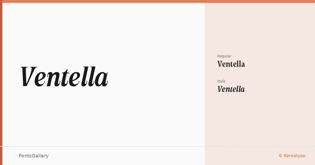
About Ventella Font
There is a particular kind of poise in the upright cut here — a serif with clean, confident strokes that sit somewhere between classical book typography and contemporary display work. Ventella comes from designer Amal Yusuf at Kereatype, and it arrives in two cuts: a Regular and an Italic, both in OTF format. The Italic carries the elegance you would expect, with a lean that feels purposeful rather than decorative.
Design Aesthetics & Character Characteristics
This is a serif family with a luxury-leaning, modern sensibility — the kind of face that reads as both classic and sharp on the same page. The two styles work together economically: the Roman holds weight and authority in headlines or logotypes, while the Italic softens the composition without losing structure. Latin character coverage keeps the forms tightly considered, without the compromises that come with extended script support.
Recommended Usage & Font Pairing
The family earns its place on book covers and magazine layouts, and it carries real presence in branding and logo work where a refined headline face is needed. For pairing, it sits well alongside Helvetica for a high-contrast editorial contrast, and works naturally with Armelie, Etna, Kactigona, or Asap when a softer or more contemporary companion is called for.
License & Usage Terms
This family is available under a Demo license — personal projects and testing only, with embedding limited to preview and print. Any professional or client-facing use requires a commercial license purchased through Creative Market (Standard) or kereatype.gumroad.com (Extended, including app, web, broadcast, and corporate use); confirm the appropriate tier before committing this face to a commercial job.