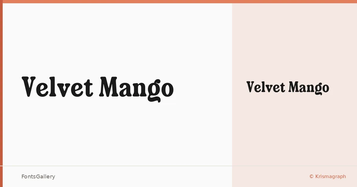
About Velvet Mango Font
There is a deliberate heaviness to this serif — the kind that holds a headline the way a carved woodblock holds ink. Designed by Ratna Krismawati for Krismagraph, Velvet Mango arrives as a single Regular weight in OTF format, its Latin letterforms carrying a classic, vintage confidence that feels drawn rather than constructed.
Design Aesthetics & Character Characteristics
The mood sits firmly in bold and elegant territory, with serifs that read as ceremonial without tipping into stiffness. For a single-cut family, it carries remarkable presence — the kind of stroke contrast and serif structure you reach for when a word needs to anchor a composition rather than simply occupy it. At display sizes, the forms reward attention; the details that make it feel vintage become the details that make it feel considered.
Recommended Usage & Font Pairing
It earns its keep in branding, poster work, magazine headlines, and logo lockups where a strong, classic serif sets the tone. Its Latin coverage makes it a reliable choice for English-language editorial and identity work. For contrast, the named pairings lean toward clean and neutral companions — Bahnschrift, Helvetica, and Rasley Heights all offer the structural counterpoint that lets this face do its work, while Angeletta and Etna bring a softer decorative balance when the brief calls for it.
License & Usage Terms
This family is released under Personal Use terms — confirm with Krismagraph before placing it in any commercial job, as a full commercial version is available separately. Embedding is permitted at the editable level.