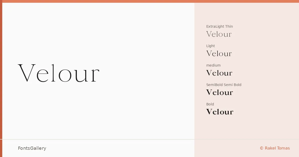
About Velour Font
There is a particular tension in this serif — it holds classical structure while pulling toward something leaner and more contemporary. Rakel Tomas of SilkType designed it with proportions that feel at home in editorial contexts as much as in luxury brand work, and the letterforms carry a quiet confidence that reads well at both display and heading sizes.
Design Aesthetics & Character Characteristics
Velour sits in elegant, modern serif territory — the kind of face that registers as refined without becoming stiff. The family spans six weights delivered as TTF files: Thin and ExtraLight at the delicate end, then Light, Regular, Medium, SemiBold, and Bold building toward something with real presence. The lighter cuts have a silk-fine quality that suits fashion and luxury contexts, while the heavier weights stay controlled enough to anchor a logo or a cover without shouting.
Recommended Usage & Font Pairing
The obvious territory is branding, logo work, book covers, and magazine layouts — anywhere a classic-yet-modern serif earns its keep. Website headers are well served by the bolder weights, while Thin and Light belong on editorial spreads with room to breathe. It pairs cleanly with Bahnschrift or Helvetica when you need a neutral sans to carry body copy, and with Angeletta, Armelie, or Etna when the brief calls for something with more decorative warmth alongside it.
License & Usage Terms
This family is available under a Demo license, which covers personal-use evaluation only — confirm licensing terms directly with SilkType before committing it to any commercial project. Embedding is permitted at the editable level.