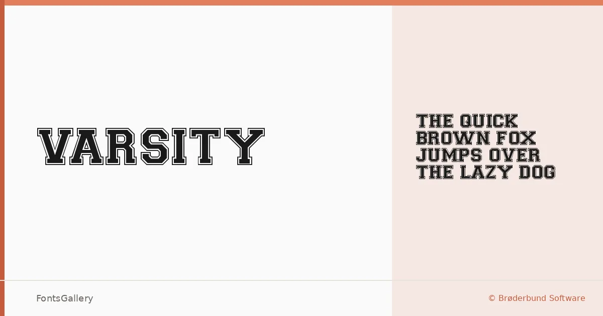
About Varsity Regular Font
There is something immediately recognizable about a slab serif that carries the weight of a stadium banner — thick strokes, confident serifs, and a silhouette that reads from a distance. This single-cut family comes from Brøderbund Software, and its sole style, Regular Varsity Regular, delivers that collegiate, athletic authority in TTF format.
Design Aesthetics & Character Characteristics
Rooted in the slab serif tradition, the design sits at the intersection of classic and vintage — the kind of letterform you associate with old sports programs, pressed tin signage, and screen-printed apparel. The mood is bold and professional without being stiff, carrying a historical solidity that makes it feel earned rather than manufactured. With only the one weight on offer, every compositional decision rests on placement, scale, and contrast with whatever surrounds it.
Recommended Usage & Font Pairing
It earns its keep in headlines, posters, logo lockups, and T-shirt design — anywhere a Latin-script statement needs to land with authority and a touch of period character. For branding work that asks for something lighter alongside it, the family pairs well with Helvetica or Aileron on the neutral sans side, while Ballmain, Abrade, and Batoshi offer more textured, expressive contrast options.
License & Usage Terms
This family is released under Personal Use terms, which means commercial use is not permitted — confirm licensing before placing it in any client or commercial job. The font does carry installable embedding permission.