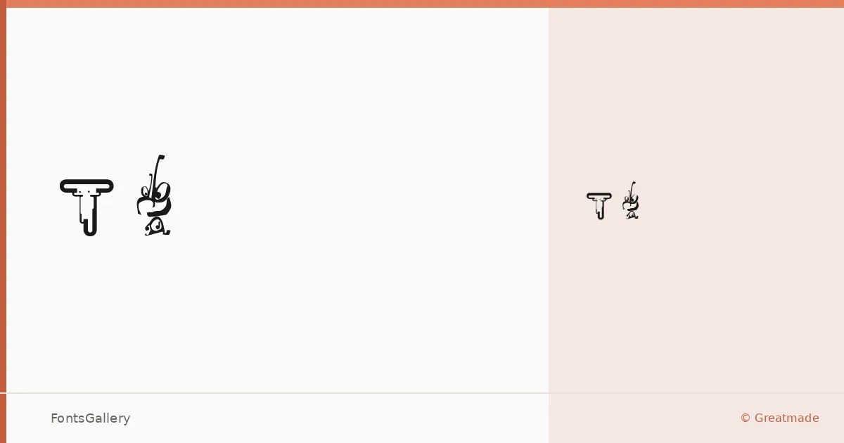
About Typos Font
There's a deliberate roughness to this script — the kind that feels like ink dragged across a slightly uneven surface, where no two strokes quite repeat themselves. It was designed by Michael Schinköthe of TYPISM, released through Greatmade, and comes as a single Regular cut in TTF format. The irregularity is the point: each letterform carries just enough imperfection to read as genuinely hand-drawn rather than mechanically constructed.
Design Aesthetics & Character Characteristics
The handwritten category here leans into grunge and rustic territory, with a whimsical, vintage undertone that keeps the texture feeling warm rather than abrasive. As a single-weight Regular, it works best where that raw, hand-lettered quality needs to do all the heavy lifting — headlines, short bursts of type, display-sized treatments. The letterforms have the looseness of something dashed off with a broad marker, but the spacing holds together well enough to stay legible at poster scale.
Recommended Usage & Font Pairing
This face earns its place in branding, logo work, poster headlines, social media graphics, and t-shirt designs — any context where a handcrafted, slightly worn personality is the whole message. For pairing, the contrast of clean, rational faces works well; AQUA, Helvetica, Aresink, Abrade, and Aranea are all listed companions that give the layout a steady foundation beneath the expressive script.
License & Usage Terms
This family is offered under Personal Use terms — commercial use is not permitted under the standard license, so confirm permissions with the foundry before taking it into a paid project. The font may be freely distributed provided it is not renamed, sold, or misrepresented as original work; embedding is set to editable.