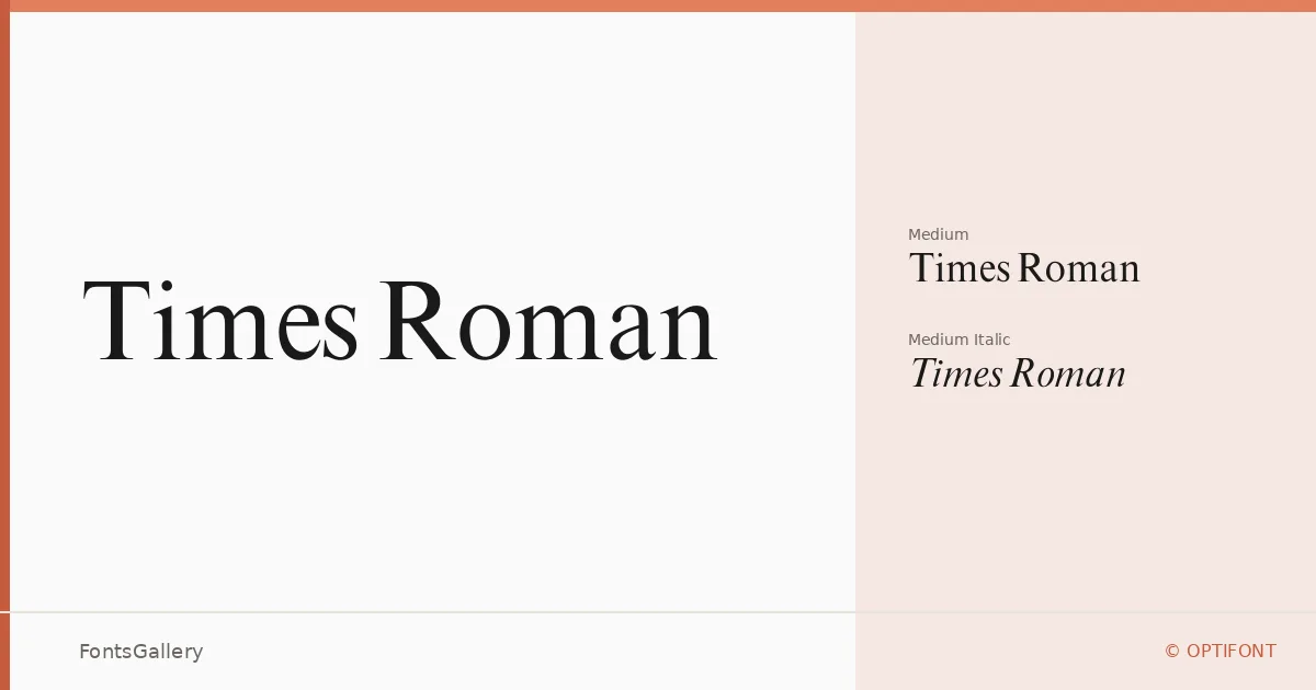
About Times Roman Font
There is something immediately recognizable about the way these serifs sit — authoritative, upright, carrying the weight of decades of editorial and literary tradition. This revival comes from OPTIFONT, whose digitization draws on the Castcraft Software lineage, and it arrives in two cuts: Medium Regular and Medium Italic, both in OTF format.
Design Aesthetics & Character Characteristics
This is a classic serif in the truest sense — high contrast strokes, bracketed serifs, and a structure that reads as professional and elegant without trying too hard. The Medium Italic is a genuine companion to the upright, with a calligraphic lean that brings warmth to an otherwise composed face. Together they occupy that vintage register that feels equally at home in a carefully typeset book or a formal business document. Latin character coverage is partial, so it is worth checking your glyph requirements before committing to a layout.
Recommended Usage & Font Pairing
The natural territory here is anywhere the text needs to carry authority — book covers, magazine headlines, business cards, and presentation decks where a classic serif signals credibility rather than novelty. The family pairs well with Helvetica for a high-contrast serif-and-sans combination, and works alongside Aileron in a similar register. Ballmain, Abrade, and Batoshi offer more expressive contrast for editorial or branding contexts where the serif anchors a livelier companion.
License & Usage Terms
This family is released under a Personal Use license, which means commercial use is not permitted — confirm licensing terms before deploying it in any client or revenue-generating work. Embedding is set to installable.