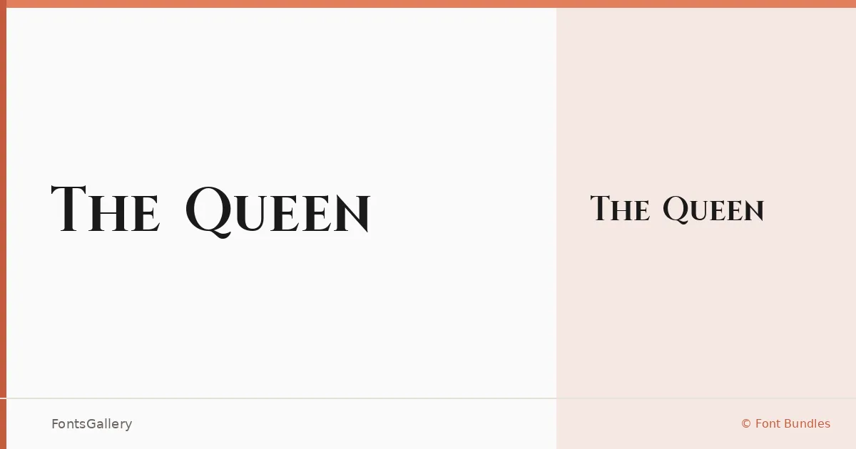
About The Queen Font
There is a particular kind of restraint in a well-drawn luxury serif — the contrast between thick and thin strokes doing the emotional work without any flourish overstepping. That is exactly what you find here: a single Roman cut from Font Bundles that carries a classical elegance in every glyph, the kind of letterform that reads as considered rather than decorated.
Design Aesthetics & Character Characteristics
This is a serif with a romantic sensibility — high contrast, refined proportions, and a mood that sits comfortably between the editorial pages of a glossy magazine and the calligraphy line of a wedding invitation. The family ships as a single Regular weight in TTF format, so the design carries its character entirely through structure rather than a range of weights. The result is a face that feels at once classic and luxurious, built for moments where tone matters as much as legibility.
Recommended Usage & Font Pairing
Its strongest applications are in branding, logo work, certificates, and wedding stationery — anywhere that Latin-script copy needs to arrive with quiet authority. It also holds its own in magazine headlines where a single display size is all that is required. For text companions, the listed pairings are Helvetica, Aileron, and Alexandria for clean neutral contrast, or Ballmain and Batoshi when a warmer, more expressive tone is the goal.
License & Usage Terms
The Queen is released under a Personal Use license, which means commercial use is not permitted under standard terms — confirm licensing directly with Font Bundles before deploying it in any paid or commercial work. The file is embedded with editable permissions.