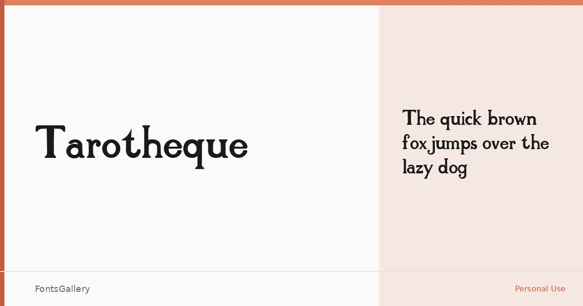
About Tarotheque Font
There is something deliberate and unhurried about these serifs — the kind of letterforms that feel drawn rather than engineered, carrying a classic elegance that sits comfortably alongside old illustrated books and refined editorial work. The single Regular weight is offered in both TTF and OTF formats, giving you clean installation options across most workflows.
Design Aesthetics & Character Characteristics
This is a serif with a distinctly vintage character — not nostalgic in a dusty way, but in the sense that the proportions and stroke contrast recall a period when type was set with genuine intention. The mood reads as classic and elegant, making it well-suited to display settings where each letter gets space to breathe. Latin character coverage keeps the focus tight and the forms consistent.
Recommended Usage & Font Pairing
It earns its place most naturally in headline and branding contexts — book cover titling, magazine mastheads, logo lockups where a single word needs to carry weight. Paired against a clean sans-serif like Helvetica or Josefin Sans, the contrast is immediate and effective; alongside something with its own warmth, such as Armelie or Kactigona, the combination feels more editorial and layered. Asap offers a more neutral middle ground if the layout calls for restraint.
License & Usage Terms
Tarotheque is released under a Personal Use license, which means commercial use is not permitted — confirm licensing terms with the rights holder before deploying it in any paid or client-facing work. Embedding is limited to preview and print only.