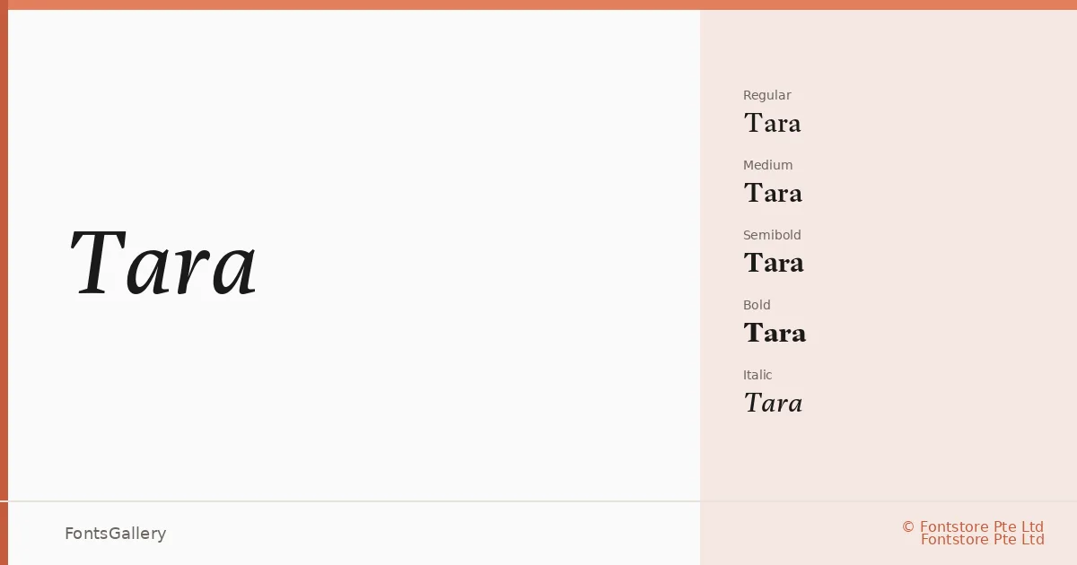
About Tara Font
There is a quiet confidence in the serifs here — they sit with enough refinement to feel luxury-facing without tipping into pastiche. Tania Alvarez, designing for Fontstore Pte Ltd, built a family that moves between classic proportions and a cleaner, more contemporary stroke contrast, keeping it useful well beyond purely decorative work.
Design Aesthetics & Character Characteristics
The family spans eight cuts across four weights: Regular and its italic, Medium and Medium Italic, Semibold and Semibold Italic, and Bold and Bold Italic — all delivered as OTF files. The range is wide enough to carry a full editorial hierarchy on its own. The mood sits firmly in elegant and modern-classic territory: think controlled stroke contrast, serifs that taper rather than slab, and italics that lean with purpose rather than simply slanting the roman. Latin script only, so coverage is focused rather than broad.
Recommended Usage & Font Pairing
It earns its keep on book covers, magazine layouts, headline treatments, and anywhere branding or logo work calls for something with a luxury register that still reads at smaller sizes. The listed pairing suggestions span the range from neutral grotesques — Bahnschrift and Helvetica — to more expressive display and script faces like Angeletta, Armelie, and Etna, giving you real flexibility in how much contrast you introduce alongside the serifs.
License & Usage Terms
This family is released under a Personal Use license, which means commercial use is not permitted — confirm clearance with Fontstore Pte Ltd at www.fontstore.com before placing it in any client or commercial work. Embedding is limited to preview and print only.