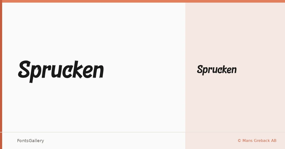
About Sprucken Font
There is a controlled roughness to this face — the kind of mark that looks like it was drawn with a broad brush on a good day, confident and slightly imperfect in exactly the right places. It comes from Mans Greback of Mans Greback AB, a foundry known for expressive lettering work. The single Regular cut is available as an OTF file, and it carries enough personality on its own that a second weight would almost crowd it.
Design Aesthetics & Character Characteristics
Handwritten in category, the letterforms land somewhere between rustic craft and vintage poster lettering, with a bold, playful energy that keeps things from feeling too nostalgic. The strokes have a hand-inked quality — slightly uneven, full of life — that reads well at display sizes but loses nothing of its character when scaled down for a logo lockup. Latin and Latin Extended (partial) character sets are included, along with Vietnamese support, which broadens its reach across multilingual branding work.
Recommended Usage & Font Pairing
This is a face built for the jobs where tone does the heavy lifting: posters, brand marks, T-shirt graphics, and social media visuals that need to feel made rather than generated. It pairs well with the clean geometry of Helvetica or AQUA when you want contrast, and sits comfortably alongside the editorial warmth of Canela, Etna, or ABC Arizona when the brief calls for something more composed.
License & Usage Terms
Sprucken is available under Personal Use terms only — confirm before any commercial job by visiting www.mansgreback.com to obtain the appropriate commercial license. Embedding is restricted under the current terms.