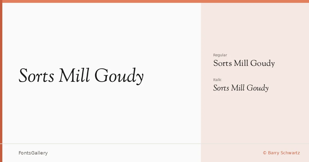
About Sorts Mill Goudy Font
There is a certain unhurried confidence to these letterforms — the bracketed serifs sit with quiet authority, the contrast between thick and thin strokes is generous without being showy, and the overall texture on the page recalls the best of early twentieth-century book typography. Designer Barry Schwartz drew this revival with clear affection for the Goudy tradition, delivering it in TTF format under an open license.
Design Aesthetics & Character Characteristics
This is a classic, elegant serif that carries a vintage weight without feeling dusty — professional enough for formal contexts, warm enough to avoid coldness. The family ships in two cuts, Regular and Italic, which together give you the essential contrast between upright authority and cursive motion. The italic in particular has a gentle slope and calligraphic pull that complements the roman rather than competing with it. Latin script coverage keeps the focus tight and clean.
Recommended Usage & Font Pairing
The combination of elegance and professional gravity makes it a natural choice for book covers, magazine headlines, certificates, and brand identities that want historical credibility without pastiche. For pairing, the clean geometry of Bahnschrift or Helvetica cuts a useful contrast against its warmth, while Angeletta, Magnolia Script, and Etna each offer a softer, more decorative counterpart for layered editorial and branding compositions.
License & Usage Terms
Released under the SIL Open Font License (OFL), Version 1.1, which allows commercial use — embedding is permitted at the installable level, so you can distribute documents with the font embedded without restriction.