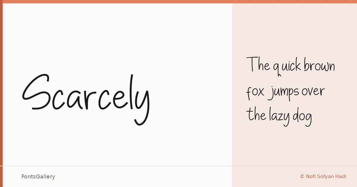
About Scarcely Font
There is a lightness to this script — the kind of unhurried, slightly irregular stroke that reads as genuinely hand-drawn rather than mechanically traced. Designed by Nofi Sofyan Hadi and released under the Heinzel Std mark, Scarcely arrives as a single Regular weight in OTF format, which is all it needs to make its character felt.
Design Aesthetics & Character Characteristics
It sits comfortably in the handwritten category, carrying a mood that is at once classic and whimsical — romantic enough for a wedding suite, playful enough for a casual greeting card. The letterforms lean gently, with the kind of natural variation in stroke weight that makes Latin text feel written rather than set. At larger display sizes that spontaneity shows best, though the face holds together at the moderate scales common to social media graphics and branding lockups.
Recommended Usage & Font Pairing
The obvious homes are invitation cards, wedding stationery, and greeting card work where a handcrafted warmth is the whole point — but it also earns its place as a headline or logo element in branding that wants personality without noise. On social media, it reads quickly and holds its elegance even at compressed image sizes. For contrast, the family pairs well with clean, structural companions like Helvetica or ABC Arizona, and it also sits naturally alongside the editorial weight of Canela, Etna, or AQUA.
License & Usage Terms
Scarcely is available under Personal Use terms, which means commercial use is not permitted — confirm licensing directly with Heinzel Std before placing it in any paid or client-facing work. Embedding is set to installable.