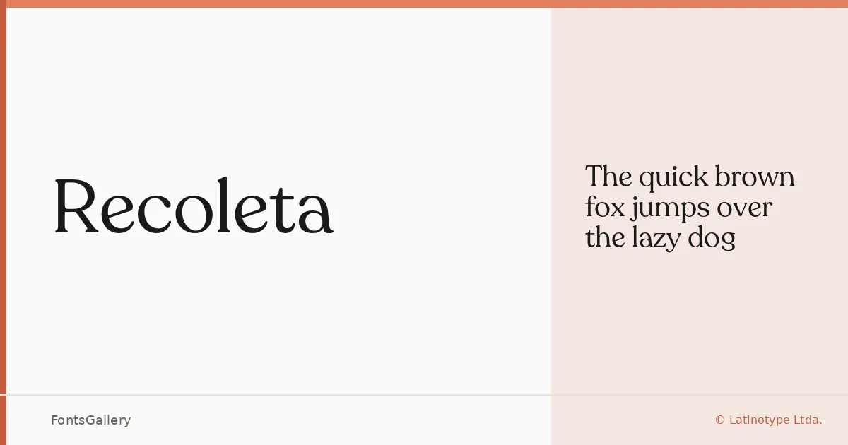
About Recoleta Font
There is something quietly assured about this serif — the kind of letterform that draws you in before you consciously notice why. It comes from Jorge Cisterna at Latinotype Ltda., and the design sits at an interesting intersection: classical proportions handled with a lightness that reads as distinctly contemporary. The single available cut is offered here as a Regular DEMO in OTF format.
Design Aesthetics & Character Characteristics
The mood is elegant without being stiff — a serif that carries associations of luxury and considered craft without tipping into the ornate. Its Latin character set is clean and controlled, and the overall rhythm feels at home in editorial contexts where a headline needs to hold attention without shouting. One weight, used well, can do a great deal of work.
Recommended Usage & Font Pairing
The forms suit book covers, magazine headers, branding systems, and logo work where a refined serif anchors the composition. It pairs naturally with Helvetica or Bahnschrift when you want a sharp sans contrast, and with softer script faces like Angeletta or Armelie when the brief calls for something warmer. Etna rounds out the pairing list if you need a secondary display option that shares a similar sensibility.
License & Usage Terms
This family is available under a Demo license, which means personal-use terms apply — confirm with Latinotype Ltda. before committing it to any commercial job. The file is set with editable embedding permission.