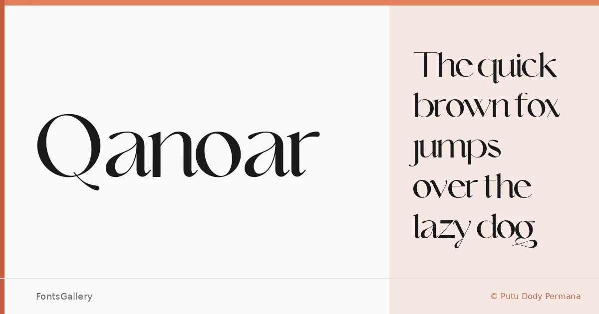
About Qanoar Font
There is a deliberate tension in these letterforms — the kind that sits between classical serif structure and something cleaner, more contemporary in its proportions. Designed by Putu Dody Permana under the Hishand Studio banner, Qanoar arrives as a single Regular cut in OTF format, built with careful attention to the kind of elegance that reads well large and holds its presence at display sizes.
Design Aesthetics & Character Characteristics
This is a serif face with a luxury sensibility — the serifs are refined rather than heavy, and the overall texture leans modern without abandoning the classic discipline that gives the category its authority. The sole Regular style means it is a focused tool: drawn for headlines, identities, and editorial moments where one well-chosen weight is enough. Latin character coverage keeps the scope tight and the drawing consistent throughout.
Recommended Usage & Font Pairing
It earns its place in branding and logo work where a sense of quiet luxury is the brief, and it carries that same composure into magazine spreads, poster headlines, and website headers. For contrast in layout work, it sits well alongside geometric or humanist sans-serifs — Helvetica, Josefin Sans, and Asap all provide the kind of clean counterpoint that lets the serif lead; Armelie and Kactigona offer a more expressive alternative when the pairing calls for it.
License & Usage Terms
Qanoar is released under Personal Use terms — confirm rights with the copyright holder, Hishand Studio, before committing it to any commercial job. Embedding is permitted at the installable level.