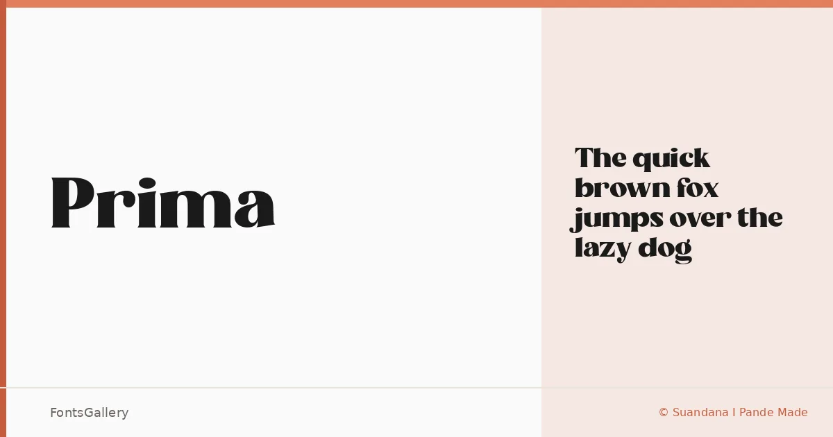
About Prima Font
There is a deliberate weight to these serifs — an upright confidence that reads as luxury without resorting to ornamentation. Prima is a single-cut serif family designed by Suandana I Pande Made, released under their own foundry. The Regular Solid style is the whole offering here, and it earns its place by doing one thing with conviction.
Design Aesthetics & Character Characteristics
The mood sits at the intersection of bold and elegant — modern in its proportions, restrained in its details. Serifs are firm and purposeful, giving headlines the kind of presence that holds its ground on a large canvas. Available as a TTF in a single Regular Solid weight, it is a face built for impact rather than extended reading, with letterforms that feel at home set large and given room to breathe.
Recommended Usage & Font Pairing
This is a display face in the truest sense: branding identities, magazine covers, poster headlines, and logo lockups are where it earns its keep. When you need contrast in a layout, it pairs well with Helvetica or Bahnschrift for a clean sans counterpart, while Etna, Armelie, and Kactigona offer more expressive options that can complement its structured character.
License & Usage Terms
Prima is distributed under a Demo license covering personal use only — confirm usage rights with the designer before applying it to any commercial job. Embedding is permitted for preview and print only.