About Palaise Font
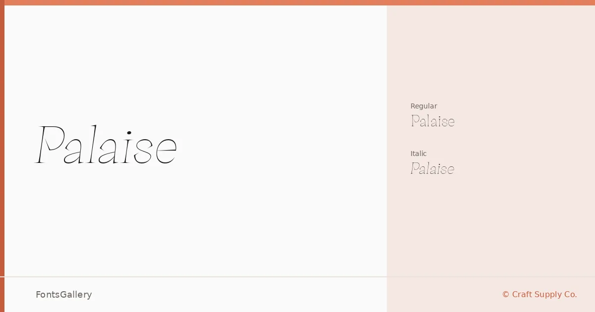
There is a particular composure to the serifs here — sturdy enough to anchor a headline, refined enough not to crowd a bridal suite invitation. Wahyu Hadi, working under Craft Supply Co., has drawn a slab serif that carries its weight with restraint. The family arrives in two cuts: Regular and Italic, both in OTF format.
Design Aesthetics & Character Characteristics
The mood sits at the intersection of classic structure and modern minimalism — slabs that feel architectural rather than heavy, with an elegance that keeps the overall impression clean. The italic leans with the same composure as the upright, making the pair feel like a matched set rather than an afterthought. Together they occupy a register that reads as polished without tipping into ornament.
Recommended Usage & Font Pairing
The character of these letterforms suits editorial headlines, logo lockups, wedding stationery, and poster work — anywhere a brand needs quiet authority on the page. For pairing, it has been recommended alongside Helvetica and Abrade for clean sans contrast, or with Allura and Vintage Melinda when something with more romantic softness is needed. (AH) Manal offers a third direction for editorial or multilingual layouts.
License & Usage Terms
Palaise is offered under a Personal Use license, which means commercial use is not permitted — confirm the terms with Craft Supply Co. before using it in any client or commercial work. Embedding is limited to preview and print only.