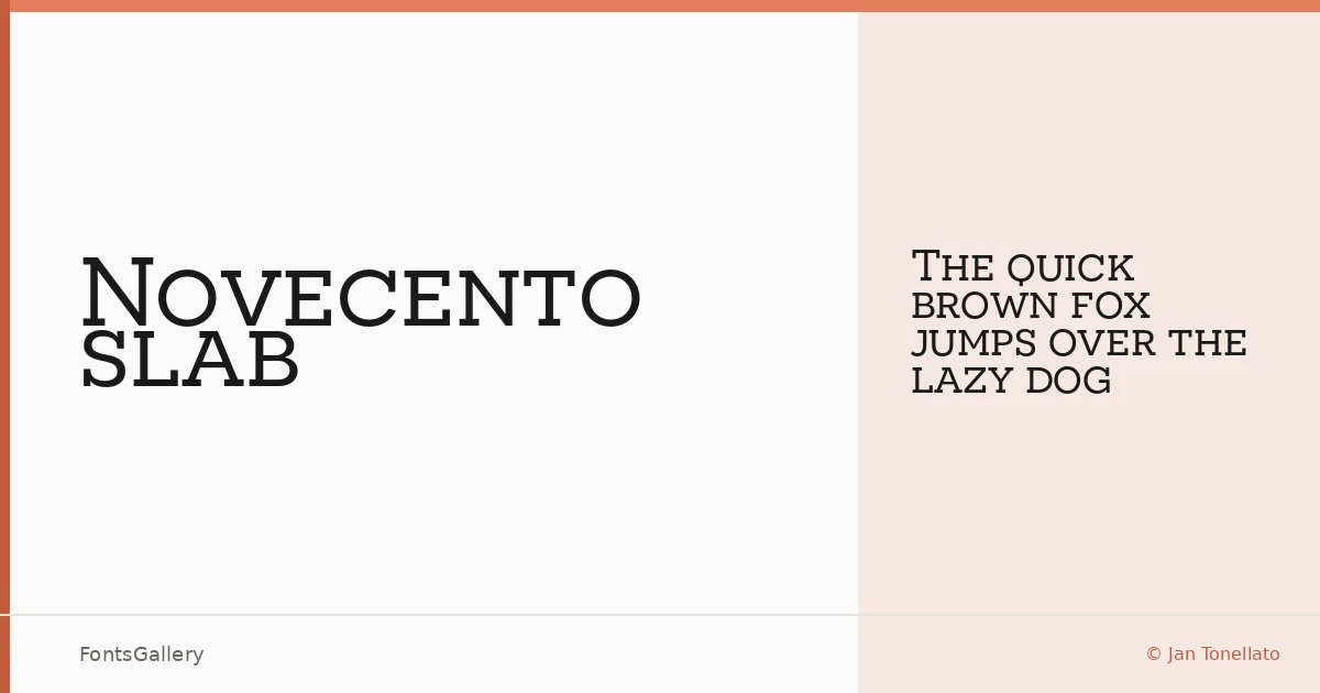
About Novecento slab Font
There is something almost architectural about these letterforms — heavy, upright, and deliberately wide, as though the capitals were drawn with a set square rather than a pen. Jan Tonellato designed this face as the slab serif companion to his Novecento Sans, drawing on the typographic mood of European printing between the latter half of the nineteenth century and the first half of the twentieth. The French typographer Xavier Dupré described it as looking as though it had been cast in concrete, and that quality is real — yet Tonellato corrected the optical weight at every junction so that what reads as blocky on the page is, in fact, carefully balanced.
Design Aesthetics & Character Characteristics
This is an uppercase and small-caps slab serif with a wide, commanding stance — classic in origin, professional in bearing, and carrying a genuine vintage authority that makes it feel at home on a poster or masthead. The family ships as a single cut, Novecento slab Wide Normal in Regular, delivered as an OTF file. Despite that single weight, the OpenType feature set is unusually thorough: stylistic alternates for Q, N, I, J, and Y; lining and oldstyle figures; tabular and proportional number spacing; custom fractions; superiors, numerators, and denominators; a slashed zero; and localized diacritics covering Romanian, Moldavian, Polish, Catalan, Dutch, Turkish, Kazakh, and several related languages. The kerning — between 750 and 950 group pairs per font — was assembled by hand, and it shows in how evenly the wide spacing sits at both headline and smaller caption sizes.
Recommended Usage & Font Pairing
The design was built expressly for headlines, branding, logo work, magazine display, and poster typography — contexts where short, high-impact text needs to hold authority at large sizes without losing composure when set smaller. Its Latin coverage makes it well suited to multilingual European branding projects where diacritic accuracy matters. It pairs with Helvetica for a clean, neutral body contrast, with the calligraphic flow of Allura or Ballmain for editorial and identity work that needs warmth against its rigidity, and with the contemporary sans cuts Aileron and Abrade for layouts that want to stay firmly in a modern register.
License & Usage Terms
This family is available for commercial use under the terms of the EULA supplied with the software, which also permits editable embedding — please refer to that agreement directly before deploying the font in any project.