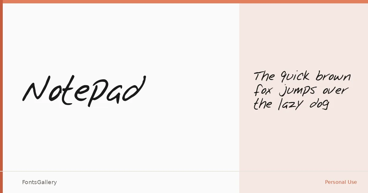
About Notepad Font
There is something immediately familiar about this script — the slight irregularity of the strokes, the way the letters lean into each other like words written in a quiet moment. It arrives as a single Thin Regular cut, a deliberately light hand that keeps the writing feeling genuine rather than constructed.
Design Aesthetics & Character Characteristics
Sitting squarely in the handwritten category, the face carries a classic, romantic quality with an undercurrent of rustic warmth — the kind of vintage character that reads as personal and unhurried. The single weight means you work with the lightness of the stroke rather than against it, which suits headline-scale settings where that thread-thin line has room to breathe. The TTF format keeps it straightforward to deploy wherever the file is needed, and the installable embedding permission means it travels with documents reliably.
Recommended Usage & Font Pairing
It earns its place on invitation cards and greeting cards where the romantic, vintage tone does real work, and it holds up equally well in branding, poster headlines, and social media graphics that want a handcrafted feeling without looking rough. For contrast and balance, it pairs well with clean or structured faces like Helvetica, or with editorial serifs such as Canela, ABC Arizona, and Etna — AQUA is another option when a softer counterpart suits the project.
License & Usage Terms
This family is released under a Personal Use license, which means commercial use is not permitted — confirm the terms with the rights holder before applying it to any client or commercial work.