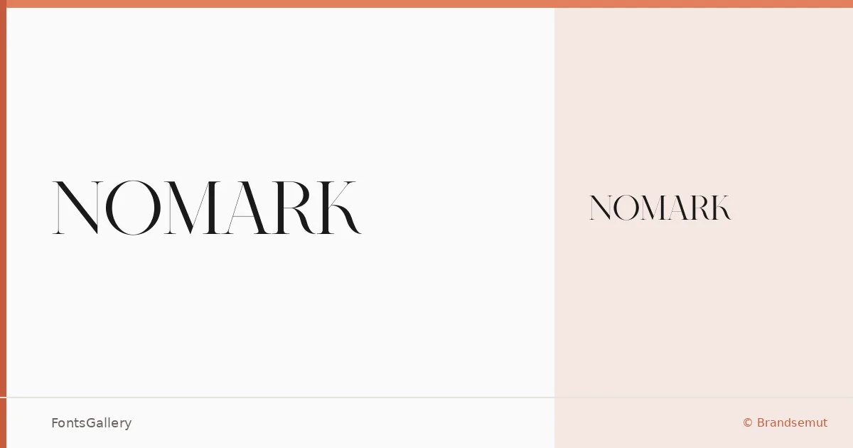
About Nomark Font
There is a quiet confidence to the serifs here — bracketed, unhurried, with the kind of considered contrast between thick and thin strokes that signals craftsmanship rather than novelty. Nomark was designed by Ahmad Sidiq under the Brandsemut foundry, and even in its single Regular weight the letterforms carry a sense of occasion.
Design Aesthetics & Character Characteristics
This is a classic serif drawn with a modern eye — the proportions feel suited to display use, where the elegance and luxury of the cuts can read cleanly at larger sizes. The family ships as a single Regular style in OTF format, so it rewards careful setting: choose it when you want one well-resolved weight rather than a system of many. The overall mood sits at the intersection of classic heritage and restrained contemporary taste, which gives it a strong identity without being showy.
Recommended Usage & Font Pairing
It earns its keep in branding work, on business cards, and in logo lockups where Latin-language copy demands something with authority and finish. Magazine covers and website headers are natural homes too, wherever a single composed word or short phrase needs to carry the weight of the design. It pairs well with Etna, Armelie, Helvetica, Kactigona, and Bahnschrift — combinations that let the serif lead while a complementary face handles running text or supporting labels.
License & Usage Terms
This family is released under Personal Use terms, and commercial use is not permitted — confirm the appropriate license with Brandsemut before placing it in any client or commercial work. The font is licensed with installable embedding permissions.