About Napoleon Font
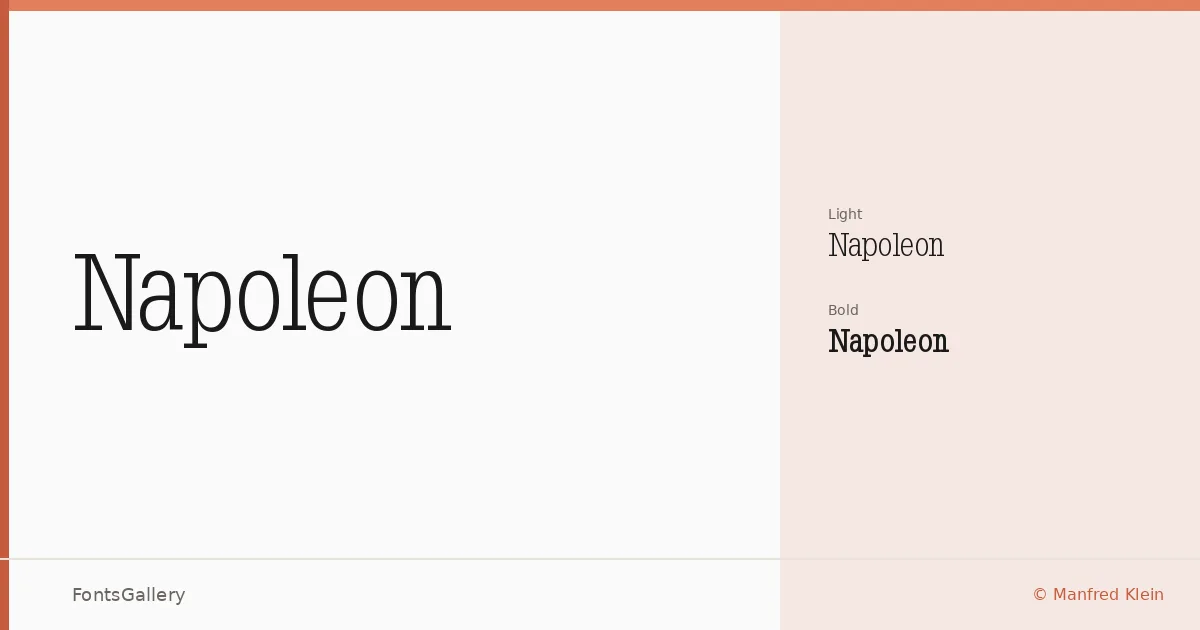
There is a commanding weight to these serifs — the kind that stops a reader before they have consciously decided to stop. Designed by Manfred Klein, this slab serif family carries the authoritative geometry of nineteenth-century display type, with bracketed slabs that feel grounded rather than decorative and letterforms that hold their composure at large sizes.
Design Aesthetics & Character Characteristics
The family ships in two cuts — Light and Bold — and the contrast between them is genuinely useful: Light carries a professional restraint suited to body-sized headlines, while Bold pushes into the classic, vintage territory that makes a poster feel intentional. The slab construction keeps things structural and even-handed, lending a mood that reads as both historic and confident without sliding into pastiche. Both styles are available as TTF files with installable embedding permission.
Recommended Usage & Font Pairing
It earns its place on book covers, magazine mastheads, branding lockups, and large-format poster work — anywhere Latin-script headlines need presence without noise. For body copy or secondary typesetting, it pairs cleanly with the neutrality of Helvetica or Josefin Sans, and sits comfortably alongside the friendlier textures of Armelie, Asap, or Kactigona when a composition needs contrast between display and text layers.
License & Usage Terms
Napoleon is available for commercial use — confirmed by the license terms — so it is ready for client work, publication, and branding projects without restriction beyond the copyright held by Manfred Klein.