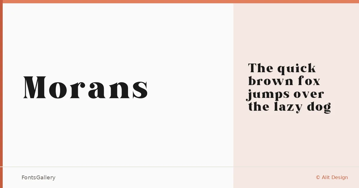
About Morans Font
There is a deliberate tension in the serifs here — the kind that reads as confidence rather than decoration. Designed by Ni Kadek Ema Pritadea under the Alit Design label, this single-cut serif carries the weight and proportion of display work: letterforms built for scale, not for running text.
Design Aesthetics & Character Characteristics
The family arrives as a single Regular weight in TTF format, which keeps things focused. The mood is bold and luxury-leaning without tipping into excess — the elegance comes from structure, not ornament. Think of the kind of modern serif that holds its ground in a headline or across a logo lockup, where each character needs to justify the space it takes.
Recommended Usage & Font Pairing
The tags tell a consistent story: branding, logos, magazine headlines, and posters are where this face earns its keep. For contrast on the page, it pairs cleanly with the geometric neutrality of Bahnschrift or Helvetica, and can hold its own alongside display companions like Angeletta, Etna, and Armelie when the brief calls for layered typographic personality.
License & Usage Terms
This family is available under Personal Use terms — "Just For Personal Use" per the license notes at alitdesign.net/license — so confirm clearance with the foundry before committing it to any commercial project.