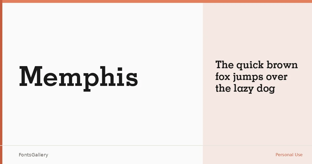
About Memphis Font
There is a certain authority to a well-cut slab serif, and this one carries it without effort. Originating from Adobe Systems — copyright dating to 1988 and 1991 — and bearing the Linotype-Hell trademark, Memphis arrives with genuine historical weight behind it. The Bold cut is the sole style in this release, delivered as an OTF file, and it makes no apology for that singularity.
Design Aesthetics & Character Characteristics
This is a slab serif with a classic, professional character and a vintage confidence that sits comfortably in the bold end of the spectrum. The strokes are sturdy and the serifs are geometric and unbracketed in the slab tradition — the kind of letterforms that read clearly at large sizes and hold the eye at poster scale. One weight, one job: commanding attention with Latin coverage and old-school conviction.
Recommended Usage & Font Pairing
The Bold weight is built for headlines, branding lockups, magazine cover lines, poster type, and logo work where a strong, structured presence is required. It pairs naturally with clean sans-serifs — Helvetica or Josefin Sans for editorial discipline, Asap for something more contemporary, and the script faces Armelie and Kactigona when a job calls for contrast between structure and flow.
License & Usage Terms
This family is offered under Personal Use terms, which means you should confirm licensing before placing it in any commercial project. Embedding is permitted at the installable level.