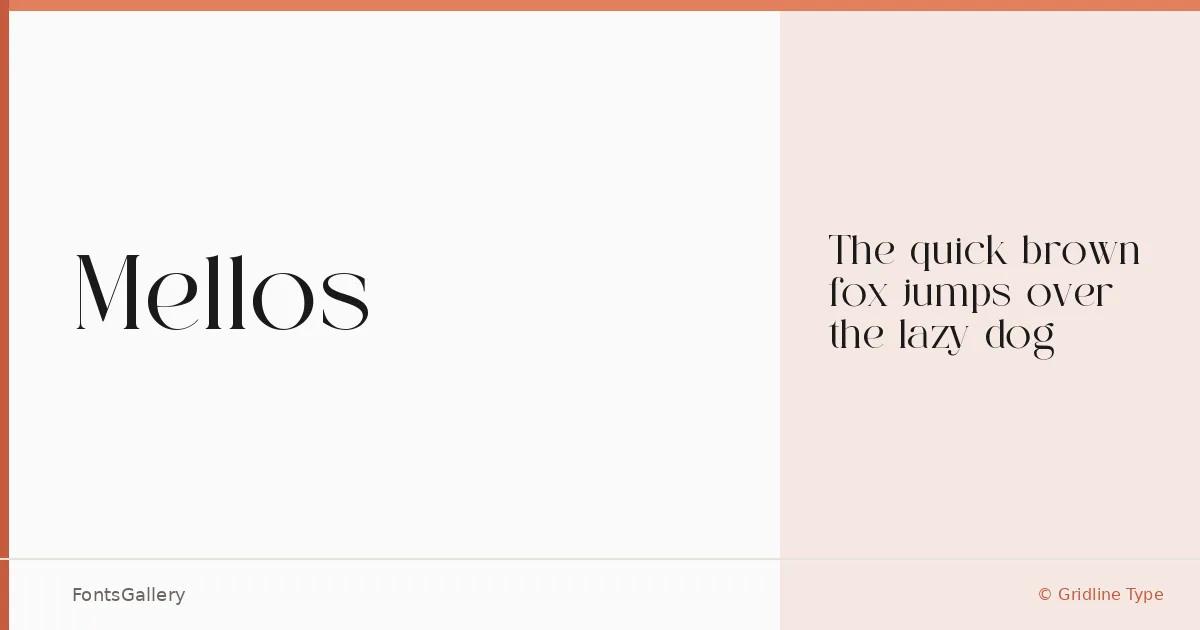
About Mellos Font
There is a particular kind of serif that earns its place in a layout through restraint rather than decoration — clean stroke contrast, confident terminals, and spacing that feels considered rather than mechanical. Mellos, from Gridline Type, is that kind of face. It carries a classic structure while reading with the crispness you associate with contemporary editorial work.
Design Aesthetics & Character Characteristics
This is a serif with a distinctly modern disposition — the proportions lean elegant without tipping into period pastiche, making it equally at home in a luxury context and a stripped-back editorial one. The family is offered in a single Regular cut, available in both TTF and OTF formats. That singular weight keeps the focus on the quality of the drawing itself: the rhythm of the capitals, the way the serifs resolve at small sizes, the overall composure on the page.
Recommended Usage & Font Pairing
It sits naturally in branding and logo work where a serif needs to project confidence without heaviness, and it holds up well as a magazine headline or poster display face across Latin-language settings. For running text or supporting layers, it pairs cleanly with neutral sans-serifs like Helvetica and Aileron, and has interesting contrast against the more expressive personalities of Ballmain, Abrade, and Batoshi.
License & Usage Terms
Mellos is released under a Personal Use license, which does not permit commercial use — confirm licensing terms with Gridline Type before deploying it on a client or revenue-generating project. The font is cleared for installable embedding.