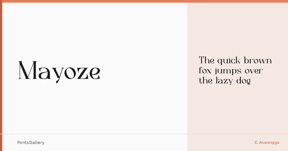
About Mayoze Font
There is a certain composed tension in these serifs — the kind that suggests a drawing hand that understood restraint. Mayoze is a single-weight serif designed by Aswangga, arriving in OTF format with Latin coverage. The letterforms carry a clean, upright confidence that sits somewhere between editorial formality and contemporary refinement.
Design Aesthetics & Character Characteristics
The mood here is classic and elegant, with a luxury edge that never tips into excess. A single Regular cut means the design earns its keep through proportion and detail rather than through weight contrast — the serifs are crisp, the spacing measured, and the overall impression one of modern restraint. It reads well at display sizes, where the structure of each glyph has room to breathe.
Recommended Usage & Font Pairing
This is a face built for high-visibility moments: a brand mark, a magazine headline, a poster, a website header where the first impression carries real weight. The Latin character set covers the needs of most Western branding and editorial work. It pairs naturally with Etna, Armelie, Kactigona, Helvetica, or Bahnschrift — each offering a different tonal contrast depending on whether you want warmth, geometry, or neutrality alongside it.
License & Usage Terms
Mayoze is available under Personal Use terms, which means commercial use is not permitted — confirm the appropriate license with the rights holder before deploying it in a client or commercial project. Embedding is set to installable.