About Manuale Font
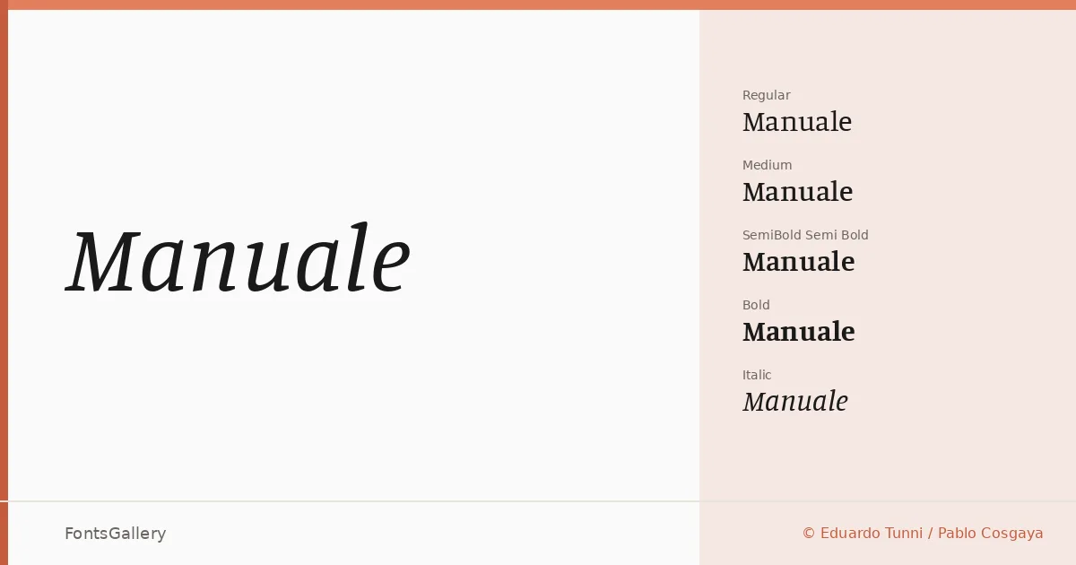
There is a considered quietness to this serif that reveals itself slowly — in the slightly bracketed serifs, the even stroke modulation, and the way the italic leans with just enough personality to feel drawn rather than slanted. Eduardo Tunni and Pablo Cosgaya of Omnibus-Type developed the family, and the result is a text serif that holds its own at display sizes without becoming theatrical.
Design Aesthetics & Character Characteristics
The family runs from Regular through Bold — Regular, Italic, Medium, Medium Italic, Semi Bold, Semi Bold Italic, Bold, and Bold Italic — giving editors and designers a genuine working range without gaps. The mood sits in a zone where classic proportions meet a modern clarity: professional enough for extended reading, elegant enough for a cover. Each weight arrives as a TTF with installable embedding permissions, so it moves comfortably across editorial and screen environments alike.
Recommended Usage & Font Pairing
The weight range makes it a natural fit for magazine layouts, book covers, branding systems, and website headers where a serif needs to hold hierarchy across several sizes. Latin Extended (partial) and Vietnamese coverage broadens its reach beyond basic Latin, which matters on multilingual publishing or branding projects. It pairs well with the geometric structure of Helvetica or Bahnschrift when you want a clean sans contrast, and sits comfortably alongside Etna, Armelie, or Kactigona when the pairing calls for something with more character.
License & Usage Terms
Manuale is released under the SIL Open Font License (OFL), Version 1.1, which allows commercial use freely — full terms and the accompanying FAQ are at http://scripts.sil.org/OFL.