About Majestic Font
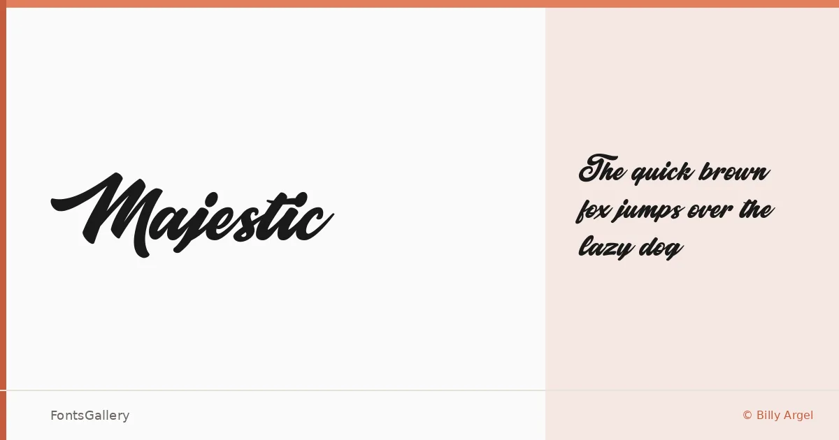
There is a confident sweep to this script — the kind of letterform that commits fully to every stroke rather than hedging toward legibility. Billy Argel designed it, and the single Regular cut is built around that bold, romantic energy: thick downstrokes, expressive loops, and an overall rhythm that reads as ceremonial without feeling stiff.
Design Aesthetics & Character Characteristics
The category is script, but the mood sits closer to vintage poster lettering than to delicate calligraphy — bold and elegant in the same breath. That combination gives the Regular weight a presence that holds at large display sizes, which is exactly where its Latin character set performs best. The TTF file drops cleanly into most workflows, and the letterforms carry enough personality that a single word set in it can anchor an entire composition.
Recommended Usage & Font Pairing
Branding, logo lockups, wedding stationery, posters, and social media graphics are where this face earns its keep — anywhere a headline needs romantic weight and a trace of period character. For contrast, it pairs well with the cool geometry of Helvetica or the editorial refinement of Canela, and it can also sit alongside Etna, AQUA, or ABC Arizona when the project calls for something with a little more warmth in the supporting type.
License & Usage Terms
This family is released under Personal Use terms only — confirm before taking it into any commercial job, and visit www.billyargel.com or contact [email protected] to obtain a commercial license.