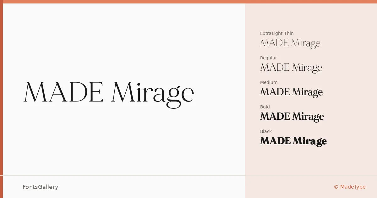
About MADE Mirage Font
There is a particular tension in this serif that earns attention immediately — the strokes carry a high contrast between thick and thin, the kind that makes headlines feel deliberate and unhurried. It comes from MadeType, and it carries a luxury editorial sensibility without tipping into pastiche. The letterforms have enough modernity in their construction to read comfortably in contemporary design contexts while holding onto the classical proportions that give a serif its authority.
Design Aesthetics & Character Characteristics
The family spans five weights — Thin, Regular, Medium, Bold, and Black — delivered as OTF files, giving you a range from delicate, almost typographic whisper at the lighter end to a commanding, full-bodied presence in Black. The mood throughout is consistent: classic and elegant, with a modern sharpness that keeps it from feeling historical. The high-contrast strokes reward large-scale use, where every curve and terminal can be read clearly.
Recommended Usage & Font Pairing
This is a face built for branding, logo work, magazine layouts, and website headers — anywhere the type needs to carry a sense of quality before a single word is read. Coverage is Latin. For pairing, the neutrality of Helvetica or Asap makes a clean counterpart to the serif's elegance, while Josefin Sans offers a slightly more geometric companion; Armelie and Kactigona can introduce a contrasting warmth depending on the project tone.
License & Usage Terms
This family is released under a Personal Use license — free for personal use only, and embedding is permitted for preview and print purposes only. Confirm licensing with MadeType before any commercial application.