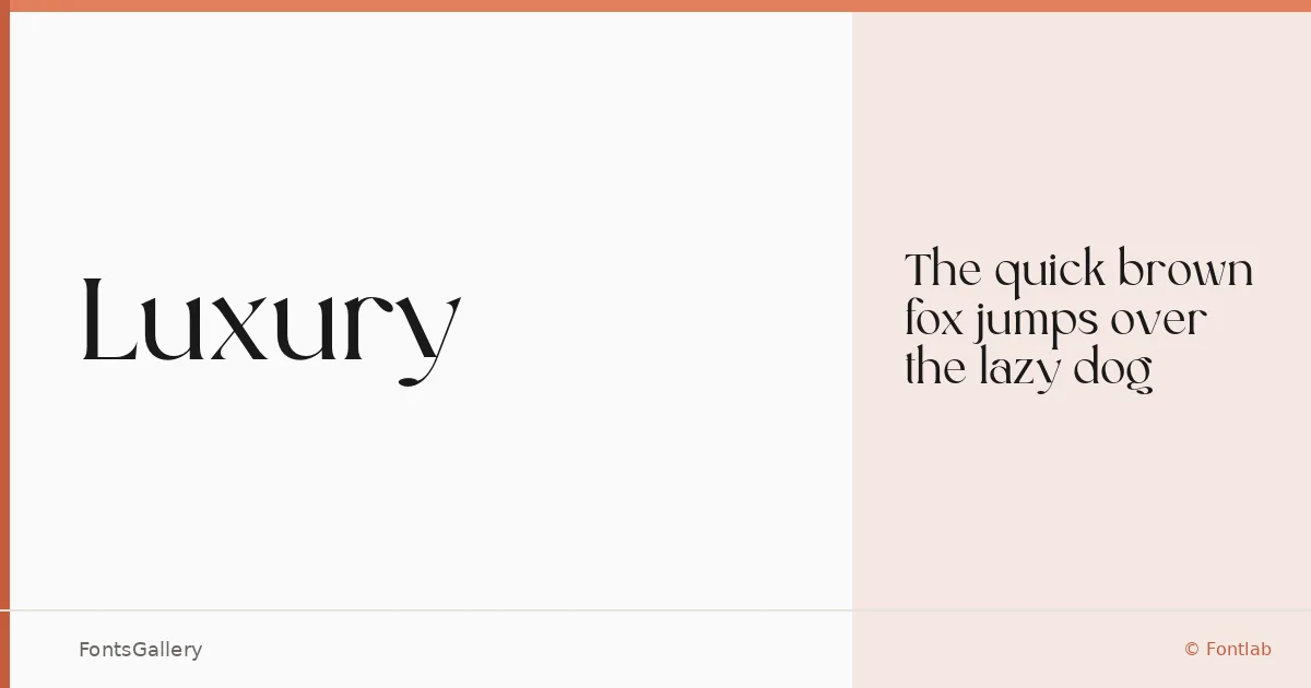
About Luxury Font
There is a deliberate stillness to these serifs — the kind of formal restraint that earns attention without competing for it. The family comes from designer Zamroni Hamzah under the Sensatype Studio banner, released in 2022. The single Regular cut arrives in OTF format, drawn with the classic proportions and refined stroke contrast that characterize high-end editorial and identity work.
Design Aesthetics & Character Characteristics
This is a serif with a clearly modern sensibility tucked inside a classical structure — elegant in its spacing, composed in its detailing, and weighted to read with authority at display sizes. The mood sits at the intersection of luxury and restraint, making it the kind of face that works as a centerpiece rather than a supporting player. Latin character coverage keeps the focus tight and the execution clean.
Recommended Usage & Font Pairing
It earns its place in branding identities, editorial magazine layouts, wedding stationery, and poster compositions where a single headline needs to carry real presence. For logo work especially, the formal structure holds up beautifully at both large and reduced scales. The listed pairing recommendations — Helvetica, Ballmain, Abrade, Batoshi, and Aileron — all bring a neutrality or complementary lightness that lets this serif remain the dominant voice in a layout.
License & Usage Terms
This family is available under Personal Use terms only — confirm licensing directly with Sensatype at sensatype.com before using it on any commercial job.