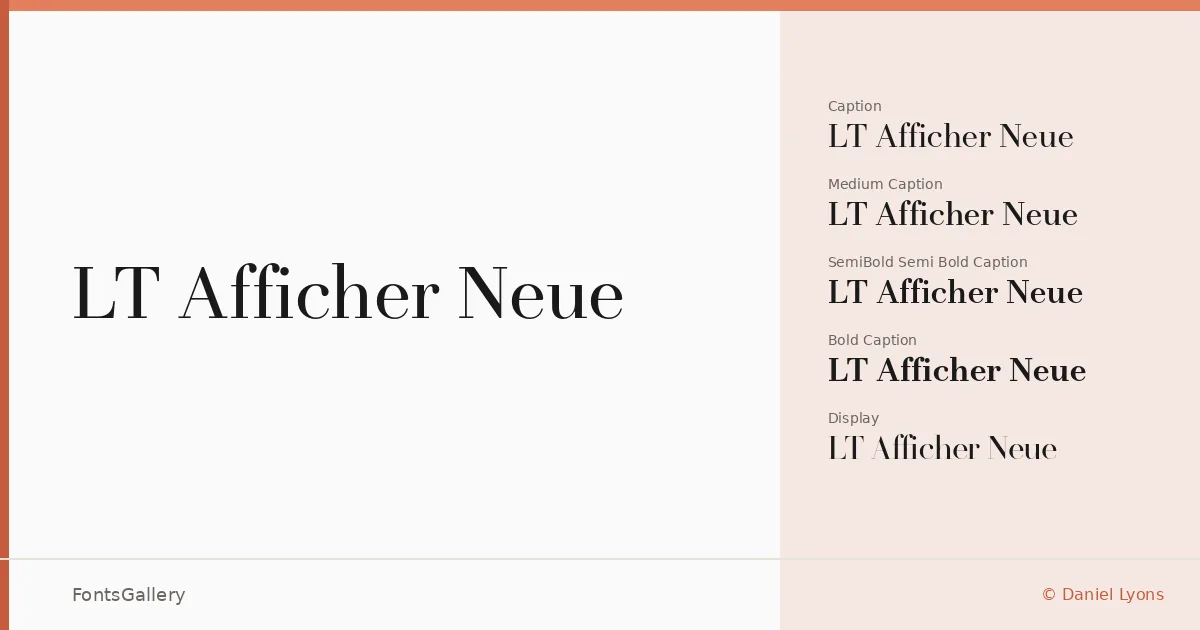
About LT Afficher Neue Font
What strikes you first is the disciplined contrast — the way thick strokes yield to fine hairlines with the kind of confidence that takes real optical calibration to achieve. Designed by Daniel Lyons, this serif family is built around four optical sizes: Caption, Text, Subhead, and Display, each tuned so the letterforms hold their elegance whether they're set small in running copy or blown up across a cover. It's a serious editorial serif with a luxury sensibility that never tips into excess.
Design Aesthetics & Character Characteristics
The family spans four weights — Regular, Medium, SemiBold, and Bold — each available across all four optical grades, giving sixteen styles in total as OTF and TTF files. The overall mood lands somewhere between classic refinement and contemporary sharpness: the serifs are precise, the spacing measured, and the proportions carry the kind of quiet authority associated with high-end magazine and branding work. Cyrillic support sits alongside Latin, making the family genuinely useful for multilingual editorial and identity projects.
Recommended Usage & Font Pairing
The optical sizing structure makes it a natural choice for book covers and magazine layouts where headline and body text need to feel like they belong to the same voice, and the bolder weights hold up well in logo and branding contexts that call for classical elegance with modern precision. For pairing, the clean geometry of Helvetica offers a strong neutral counterpoint, while Allura or Vintage Melinda introduce a contrasting softness for luxury and lifestyle contexts; (AH) Manal and Abrade both bring a different structural energy that can keep multi-element layouts from feeling too uniform.
License & Usage Terms
LT Afficher Neue is available for commercial use under its stated license terms, though embedding is permitted for preview and print only, so review those constraints before incorporating the fonts into interactive or app-based workflows.