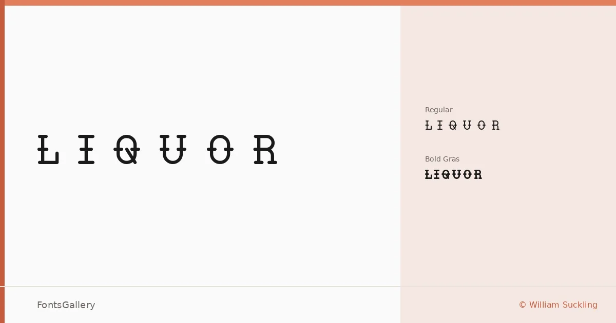
About LIQUOR Font
There is a deliberate heaviness to these letterforms — the kind of slab-serif weight that feels carved rather than drawn. William Suckling of Bayley Design built this family with a rugged confidence that sits somewhere between a 19th-century label and a contemporary craft aesthetic. The serifs are blunt, the strokes have presence, and nothing about the design apologizes for taking up space.
Design Aesthetics & Character Characteristics
This is a slab serif that leans fully into its rustic, vintage character — bold and classic in the way that old-world signage and hand-lettered packaging tend to be. The family ships in two cuts, Regular Normal and Bold Gras, as TTF files, giving you a workable weight contrast within a tight palette. The Bold Gras especially rewards use at display sizes, where the thick slabs and sturdy proportions develop real authority. Coverage extends across Latin, Cyrillic, and Greek, making the family more broadly deployable than its narrow two-style range might suggest.
Recommended Usage & Font Pairing
The natural territory here is branding, logo work, packaging, and poster design — anywhere a vintage or rustic tone needs to read immediately and memorably. It also holds up well in T-shirt design, where the robust slab construction survives reduction and printing noise. For pairing, the clean geometry of Bahnschrift or Helvetica offers a sharp counterpoint to its rougher edges, while Angeletta, Magnolia Script, or the more structured Etna can bring complementary warmth or contrast depending on the direction of the layout.
License & Usage Terms
LIQUOR is released under Personal Use terms — free for personal use, but you should confirm a commercial license with Bayley Design at bigcartel.com/bayleydesign before committing it to any paid or commercial job.