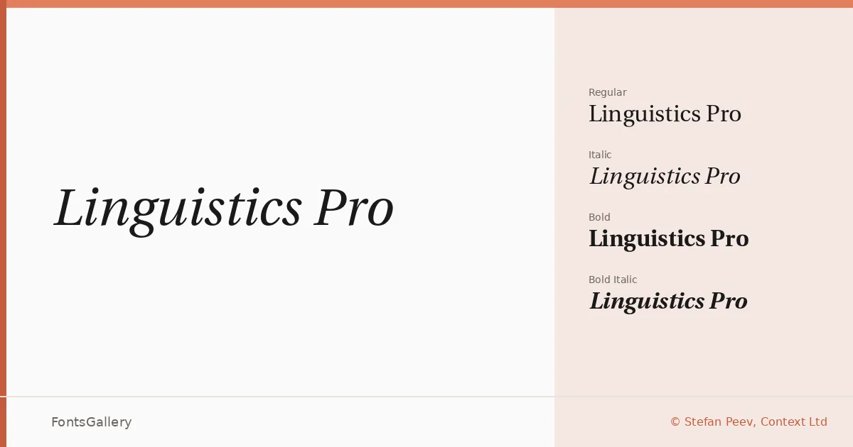
About Linguistics Pro Font
There is a particular steadiness to these serifs — the kind that comes from a long lineage of careful refinement rather than a single designer's impulse. Stefan Peev of Context Ltd built this family as a modification of Adobe's Utopia, drawing on subsequent layers of work by contributors including the GUTenberg project, Han The Thanh, Andrey V. Panov, and Andreas Nolda, before shaping it into its current form in 2016. The result carries the authority of a text face with genuine classical roots, while its proportions and detailing feel measured and contemporary.
Design Aesthetics & Character Characteristics
This is a serif family with a professional, elegant disposition — classical in structure but with enough crispness to read as modern in context. The four OTF cuts — Regular, Italic, Bold, and Bold Italic — give you a complete working system: upright and oblique voices at two weights, which is exactly what editorial and corporate work demands. The italic has the kind of incline that assists reading without drawing attention to itself, and the bold carries weight without coarsening the letterforms.
Recommended Usage & Font Pairing
The multi-script coverage — Latin, partial Latin Extended, Vietnamese, Cyrillic, and Greek — makes this a practical choice for publications and presentations that move across language communities. It earns its place in book cover design, magazine layouts, branding, and website headers where a composed, professional tone is expected. For pairing, it works alongside Helvetica and Bahnschrift as sans companions, or against contrasting serif and display faces such as Etna, Armelie, and Kactigona.
License & Usage Terms
Released under the SIL Open Font License, Version 1.1, which permits commercial use; embedding is set to installable, so you can deploy it freely in documents and applications without additional clearance.