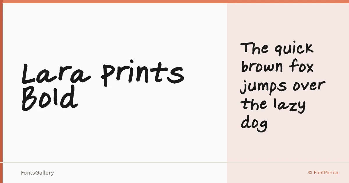
About Lara Prints Bold Font
There's an unmistakable hand-pressed quality to these letterforms — the kind that suggests actual ink meeting actual paper rather than a cursor dragging a bezier. FontPanda built the face from hand-drawn originals scanned through Scanahand, and that origin is readable in every stroke: slightly irregular, warm, and confidently weighted. The result sits firmly in handwritten territory without sliding into cursive formality.
Design Aesthetics & Character Characteristics
The family ships as a single cut — Regular — in TTF format, and the printing-style letterforms carry a playful, rustic character that stops well short of feeling rough. Think of it as the whimsical end of the hand-lettering spectrum: loose enough to feel personal, legible enough to carry real copy. The bold stroke weight means it holds its presence at display sizes without needing any extra tricks.
Recommended Usage & Font Pairing
The weight and mood make it an obvious candidate for children's book titles, greeting cards, and invitation cards where warmth matters as much as clarity. It also translates well to poster headlines and social media graphics where a single line of type needs personality rather than precision. For contrast pairings, it has been listed alongside Canela, Etna, ABC Arizona, Helvetica, and AQUA — any of those cleaner, more structured faces will give the body text the separation it needs.
License & Usage Terms
No license terms were provided with this family, so confirm usage rights directly with FontPanda before taking it into a commercial job. The font file does carry editable embedding permission.