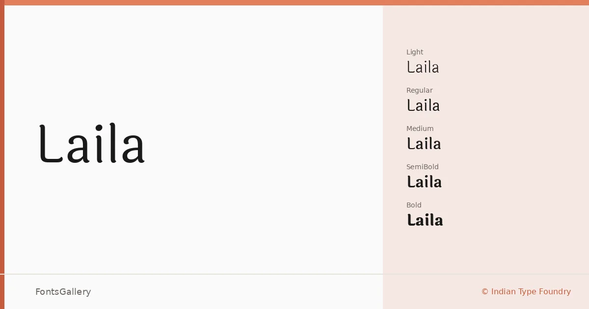
About Laila Font
There is something quietly authoritative about this serif's proportions — the stroke contrast is measured, the serifs are refined without being delicate, and the overall construction sits comfortably between classical book typography and contemporary editorial work. It was designed by Hitesh Malaviya at Indian Type Foundry, and its defining achievement is genuine dual-script support: the family covers both Latin and Devanagari, with each script drawn to feel like a natural companion to the other rather than an afterthought.
Design Aesthetics & Character Characteristics
The family runs five weights — Light, Regular, Medium, SemiBold, and Bold — delivered as TTFs, giving you enough range to build a complete typographic hierarchy within a single family. The mood is classic and professional, but the letterforms carry a modern clarity that keeps them from feeling stiff. At lighter weights the elegance is most apparent; at Bold, it holds its structure without crowding. Both scripts share that disciplined composure throughout the range.
Recommended Usage & Font Pairing
The weight range and dual-script coverage make this family well suited to book covers, magazine layouts, website headers, and branding work that needs to address Latin and Devanagari audiences within the same design system. For pairing, the clean geometry of Helvetica or Bahnschrift contrasts well against its serifs, while Armelie, Etna, and Kactigona offer more expressive display options when you need the heading to carry additional character.
License & Usage Terms
Laila is released under the SIL Open Font License, Version 1.1, which permits commercial use; full terms and the accompanying FAQ are at http://scripts.sil.org/OFL. Embedding is set to installable, so the fonts may be bundled with documents and applications within the scope of that license.