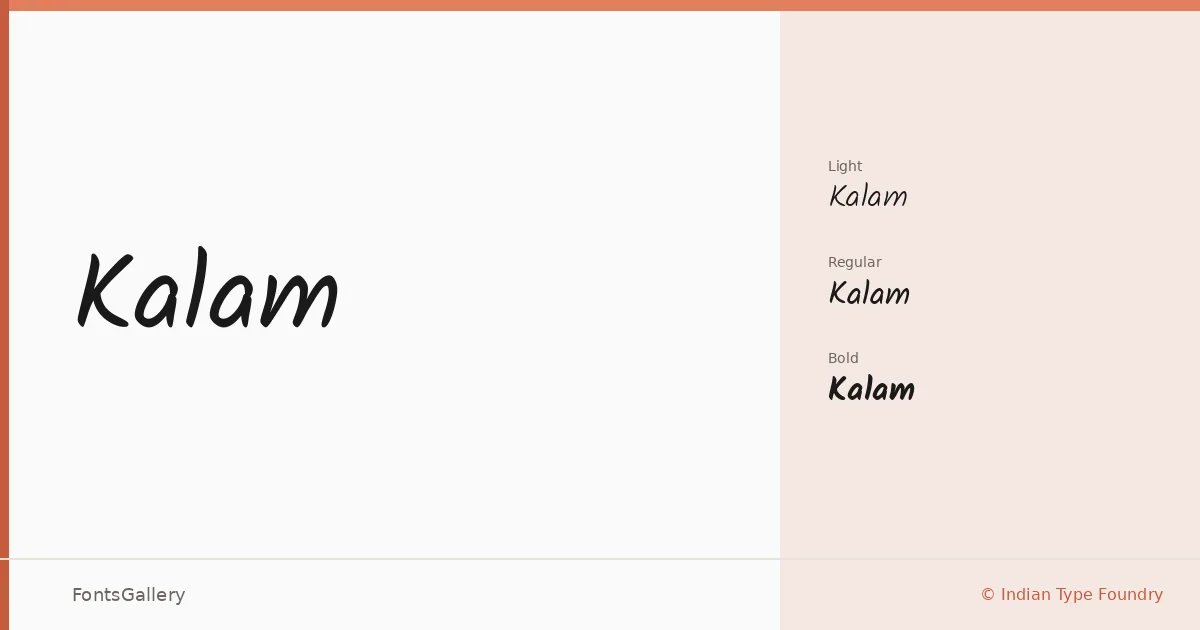
About Kalam Font
There is a looseness to the letterforms here that reads less like casual handwriting and more like the confident ink of someone who writes quickly but with care — strokes that lean into each other without collapsing. Designed by Lipi Raval for both Devanagari and Latin scripts, with Jonny Pinhorn contributing to the Latin side, this is a release from Indian Type Foundry that takes bilingual handwritten type seriously. The Devanagari carries the same energy as the Latin rather than feeling grafted on as an afterthought, which is rarer than it should be.
Design Aesthetics & Character Characteristics
The family sits in handwritten territory with a mood that moves between playful and rustic — whimsical enough for a child's world, grounded enough for branding that wants warmth without sentimentality. Three weights are available: Light, Regular, and Bold, delivered as TTF files. The Light has an airy, notebook quality; the Bold lands with enough presence for headline use without losing the hand-drawn rhythm that runs through all three cuts.
Recommended Usage & Font Pairing
The natural habitats are greeting cards, children's books, social media graphics, and posters where a human touch matters more than precision. Because the Devanagari and Latin scripts share a consistent texture, it works well for bilingual projects reaching Hindi and English audiences simultaneously. For contrast, it pairs with Canela or ABC Arizona when you want an editorial serif underneath it, and Helvetica or Etna when a clean sans is the right counterweight; AQUA is worth considering when the brief calls for something more decorative alongside it.
License & Usage Terms
Released under the SIL Open Font License, Version 1.1, which permits commercial use — full terms and the accompanying FAQ are at http://scripts.sil.org/OFL. Embedding is set to installable, so you can distribute documents with the font embedded without restriction.