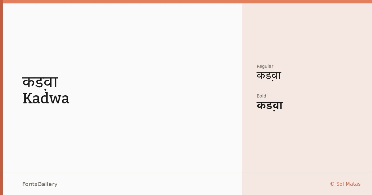
About Kadwa Font
There is something quietly assured about the way these serifs sit on the baseline — upright, unshowy, with a classical structure that never tips into stiffness. Sol Matas, working under the Huerta Tipográfica banner, built this family to carry two distinct scripts: Latin and Devanagari. That dual-script commitment is the defining fact about it, and it shapes the proportions and stroke contrast across every glyph.
Design Aesthetics & Character Characteristics
The family arrives in two cuts — Regular and Bold — both delivered as TTF files. The mood sits at the intersection of minimal and professional: serifs that read as modern without abandoning the classical skeleton that makes serif type trustworthy at length. The Bold earns its keep as a display weight, bringing enough density to anchor a headline without resorting to slab aggression. At text sizes the Regular holds an open, even color that suits sustained reading.
Recommended Usage & Font Pairing
The Latin and Devanagari coverage makes it a practical choice for bilingual publishing — book covers, magazine spreads, and website headers where both scripts need to share a visual register. For branding work the pairing options are generous: the clean geometry of Helvetica or Bahnschrift will offset the serif warmth nicely, while Etna and Kactigona offer more personality-driven combinations. Armelie brings a contrasting softness if the layout calls for something lighter alongside it.
License & Usage Terms
Kadwa is released under the SIL Open Font License (OFL), Version 1.1, which permits commercial use — full terms and the accompanying FAQ are available at http://scripts.sil.org/OFL. Embedding is set to installable, so documents distributed with the font embedded are covered under those same terms.