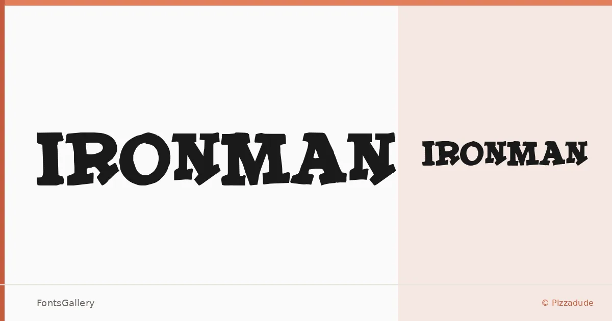
About IronMan Font
There is a deliberate roughness to this slab serif — the kind of weight and texture that feels stamped rather than printed, worn rather than designed yesterday. It comes from Pizzadude, the project of Jakob Fischer, and exists as a single Regular cut in TTF format.
Design Aesthetics & Character Characteristics
The slab construction leans into grunge and rustic territory, with a vintage character that stops well short of nostalgia and lands closer to raw authority. The serifs carry real mass, and the overall texture reads as intentionally imperfect — the kind of letterform that holds its own at large sizes without needing ornamentation to do the work. There is one style in the family, so what you see is the full range: a single, committed weight built for impact.
Recommended Usage & Font Pairing
This is a headline and display face — best suited to posters, branding, logo lockups, and T-shirt design where that grunge weight reads as an asset rather than noise. For contrast in a layout, it has been paired alongside the clean geometry of Bahnschrift and Helvetica, the flowing character of Magnolia Script and Angeletta, and the structured warmth of Etna — combinations that let the slab carry the heavy lifting while something lighter handles supporting text.
License & Usage Terms
No license terms were provided with this family, so commercial use cannot be confirmed — check directly with Jakob Fischer at pizzadude.dk before deploying it in a paid project. The font's copyright notice explicitly prohibits redistribution without the author's permission, and embedding is listed as installable.